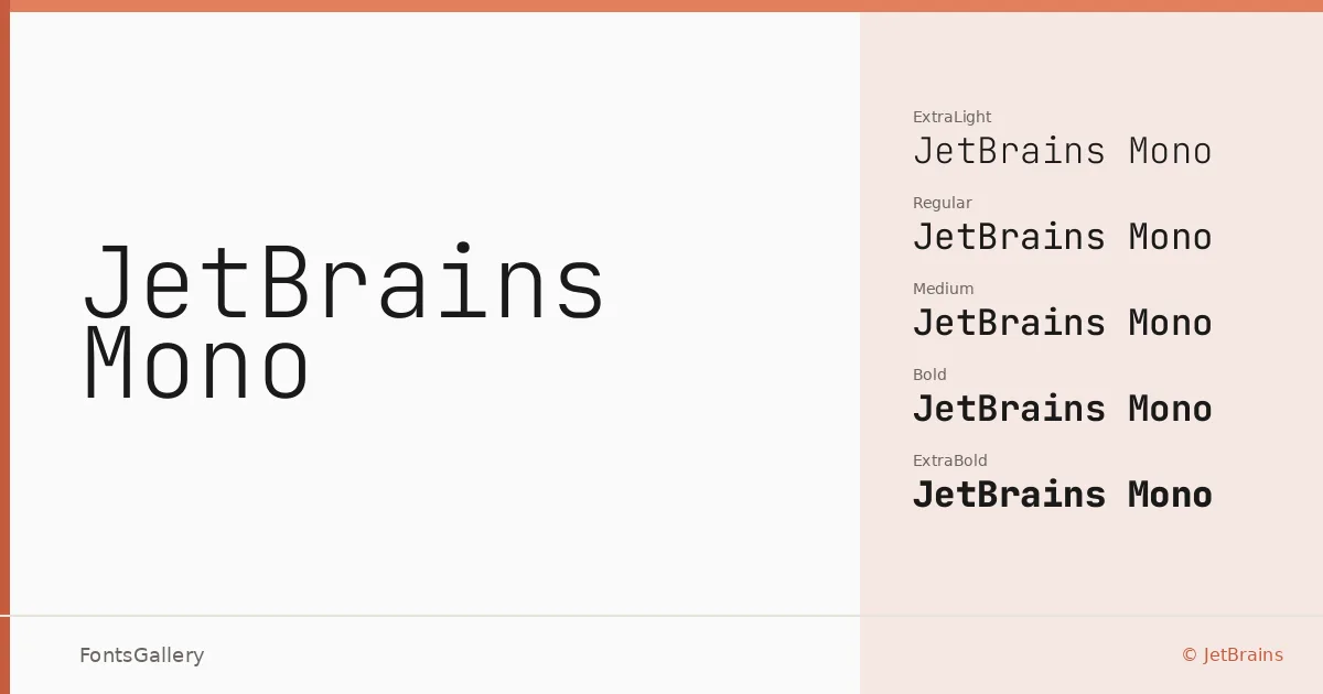
About JetBrains Mono Font
Every character sits in an identical horizontal slot — that fixed cadence is the whole point, and Philipp Nurullin and Konstantin Bulenkov at JetBrains have shaped each glyph to make that constraint feel deliberate rather than limiting. The letterforms carry a clean, geometric restraint: open apertures, low stroke contrast, and a proportional rhythm that stays legible even at small sizes. The family spans Latin, Vietnamese, Cyrillic, and Greek, making it genuinely useful across multilingual projects.
Design Aesthetics & Character Characteristics
This is a monospace family with a modern, minimal character — futuristic in its precision without leaning into the cold industrial look that traps many coding faces. The weight range runs from Thin and ExtraLight through Light, Regular, Medium, and SemiBold up to Bold and ExtraBold, with italic companions at every step. Two variable fonts round out the set, giving you continuous weight control in environments that support it. All styles are delivered as TTF files with installable embedding permission, so they travel well inside documents and applications.
Recommended Usage & Font Pairing
The professional, minimal tone makes it a natural choice for branding systems, website headers, signage, presentation decks, and logotype work where structured precision reads as confidence. The weight span means you can build typographic hierarchy within the family alone, or contrast its monospace texture against a humanist or editorial companion — it pairs well with Helvetica and Asap for clean, systematic layouts, and sits interestingly against the high-contrast elegance of Canela or ABC Arizona when you want that tension between the mechanical and the literary. Etna is another listed pairing worth exploring when the project calls for something with more structural character.
License & Usage Terms
Released under the SIL Open Font License, Version 1.1 — commercial use is explicitly permitted, and full terms are available at https://scripts.sil.org/OFL.