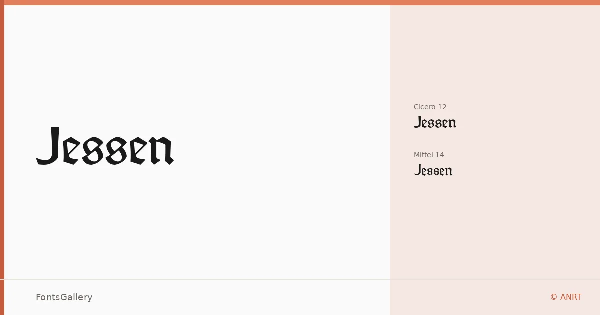
About Jessen Font
Rudolf Koch cut this hybrid of gothic minuscules and roman capitals directly in metal at Offenbach am Main — no preliminary drawings — for use in a printing of The Four Gospels at the Klingspor press in 1926. Originally called Bibel-Gotisch, the type was released commercially as Jessen by the Klingspor foundry in 1930. Alexis Faudot and Rafael Ribas, working under the direction of Jérôme Knebusch at the Atelier National de Recherche Typographique (ANRT) in Nancy, produced this digital revival drawing on period sources including the 1934 Klingspor specimen and Koch's own 1929 Blumenbuch.
Design Aesthetics & Character Characteristics
This is a blackletter with a decidedly classic and elegant temperament — the gothic stroke architecture carries genuine weight and vintage authority without feeling decorative for its own sake. The family ships in two optically distinct OTF cuts: Cicero 12, sized for smaller text settings, and Mittel 14, calibrated for larger display work. Latin script is supported in partial coverage, so character set depth is worth checking against your copy before committing to a project. The forms reward careful, deliberate typesetting — this is not a face that disappears into the background.
Recommended Usage & Font Pairing
The bold, ceremonial quality of these letterforms makes them a natural fit for book covers, certificates, posters, and branding and logo work that calls on historical resonance. For contrast pairings, the family holds well alongside the warm serif of Canela, the clean neutrality of Helvetica or Bahnschrift, and more structured contemporaries like Etna or ABC Arizona — the gothic texture sets off roman and grotesque companions cleanly.
License & Usage Terms
Released under the SIL Open Font License (OFL 1.1), which allows commercial use. Embedding is permitted for preview and print only.