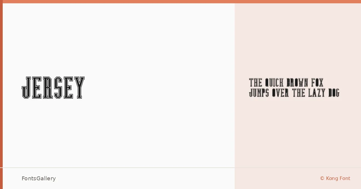
About Jersey Font
There is something immediately physical about this slab serif — the strokes carry a confident weight, and the serifs land with the kind of decisiveness you associate with hand-painted signs and vintage athletics lettering. Kong Font released it in 2022, and the single Regular cut distills the design down to its essential character: sturdy, no-nonsense, and built for impact.
Design Aesthetics & Character Characteristics
The mood sits firmly in bold, classic territory — rustic without being rough, vintage without leaning into pastiche. As a slab serif delivered in TTF format, it carries the visual density needed to anchor a composition rather than fill it. Every letterform feels like it belongs on something tangible: a label, a storefront, a jersey number. The single Regular style means you work with the weight as given, which keeps the focus on placement and scale.
Recommended Usage & Font Pairing
The design earns its place in branding, logo work, poster headlines, signage, and t-shirt design — anywhere the Latin character set is sufficient and a strong typographic presence matters more than fine-grained copy. It pairs well with the clean neutrality of Helvetica or Bahnschrift, and contrasts interestingly against the personalities of Armelie, Etna, or Kactigona, depending on how much tension you want in the layout.
License & Usage Terms
This family is released under Personal Use terms, which means commercial use is not permitted — confirm licensing directly with Kong Font at [email protected] before deploying it in any paid or commercial work.