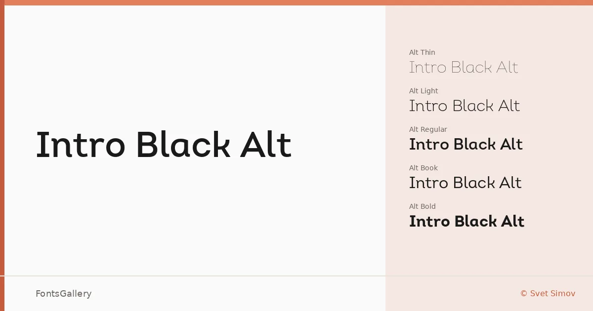
About Intro Black Alt Font
There is a clean, deliberate geometry to these letterforms — the kind that reads as intentional restraint rather than simplicity. Svet Simov has shaped a sans serif where each glyph earns its weight, with alt character forms that introduce just enough personality to separate it from the anonymous crowd of geometric grotesques.
Design Aesthetics & Character Characteristics
The family spans five weights — Thin Alt through Bold Alt, covering Thin, Light, Book, Regular, and Bold — all delivered as OTF files. The overall character is modern and professional, with a minimal tension that makes lighter cuts feel airy and editorial while the bolder weights carry real presence in display contexts. The alternate forms are the distinguishing detail: they shift the tone from purely neutral toward something with considered flair.
Recommended Usage & Font Pairing
The weight range makes this a natural fit for branding systems, magazine layouts, and website headers, where the lighter cuts can anchor body hierarchy and the bolder weights drive headlines and logo lockups. For pairing, the editorial serif Canela works well against its geometric neutrality, while Armelie, Urban Thunder Demo, AQUA, and Kactigona each offer contrasting textures — from calligraphic to display — that the clean sans structure supports comfortably.
License & Usage Terms
This family is released under a Donationware license, which covers personal use only — confirm terms with the designer before committing it to any commercial job.