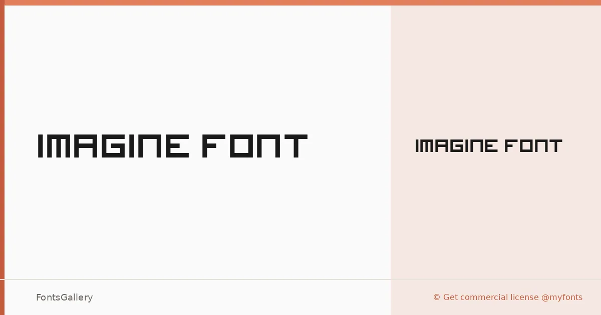
About Imagine Font Font
There is something deliberately architectural about these letterforms — each character carrying a geometric, almost cubic weight that feels constructed rather than drawn. Designed by Jooki, this display face sits in a space between industrial rigidity and forward-looking structure, with a single Regular cut that commits fully to its own logic.
Design Aesthetics & Character Characteristics
The family lands squarely in display territory, built for settings where presence matters more than running text. Its mood is bold and futuristic without being decorative — the forms read as modern and professional, the kind of thing that holds up at large sizes on a poster or against a stark background. The Imagine Cube variant belongs to the same broader family, extending that cubic sensibility further. Available in both TTF and OTF formats, it covers Latin script at partial range, so check your character requirements before committing.
Recommended Usage & Font Pairing
This is a face for headlines, logos, branding work, and poster compositions — anywhere a single strong typographic voice anchors the layout. T-shirt design is a natural fit given the weight and clarity at display scales. For text companions, the geometric confidence pairs well with Helvetica or Asap for neutral body copy, while Canela, Etna, or AQUA can introduce contrast when you want something with more personality sitting alongside it.
License & Usage Terms
This family is released under Personal Use terms — specifically a Creative Commons Attribution Non-commercial No Derivatives license — which means it is not cleared for commercial work as distributed here; confirm and obtain a commercial license through MyFonts before using it in client or revenue-generating projects.