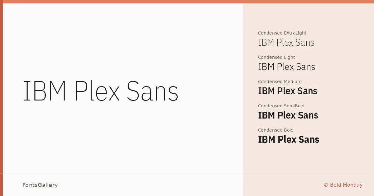
About IBM Plex Sans Font
There is a deliberate, almost architectural calm to these letterforms — the kind of restraint that comes from a brief with real constraints behind it. Designed by Mike Abbink, Paul van der Laan, and Pieter van Rosmalen at Bold Monday, the family was built to carry IBM's visual identity at every scale. The details reward close reading: humanist touches soften what could have been a purely mechanical construction, keeping text readable without sacrificing the precision the design demands.
Design Aesthetics & Character Characteristics
Classic yet rigorously modern, this sans serif sits comfortably in the professional and minimal end of the spectrum. The family spans an unusually broad weight range — Thin through Bold — across upright, italic, condensed, semi-condensed, and a variable format, all delivered as TTFs. Width variants give you genuine typographic flexibility within a single cohesive system rather than forcing you to reach for a second family, and the italics hold their own as display cuts rather than feeling like mechanical obliques.
Recommended Usage & Font Pairing
The condensed and semi-condensed widths are natural choices for magazine layouts and presentation decks where column space is tight; the regular and medium weights handle website headers and business card hierarchies cleanly. Latin, Vietnamese, Cyrillic, and Greek coverage makes it a practical choice whenever copy moves across multiple scripts. For contrast, the listed pairings — Canela, Armelie, 321 Impact, AQUA, and Kactigona — each pull in a different direction, from editorial serif warmth to decorative display weight, giving you a range of tonal options depending on the job.
License & Usage Terms
Released under the SIL Open Font License, Version 1.1, with installable embedding permissions — commercial use is expressly permitted, and the full license terms including an FAQ are available at http://scripts.sil.org/OFL.