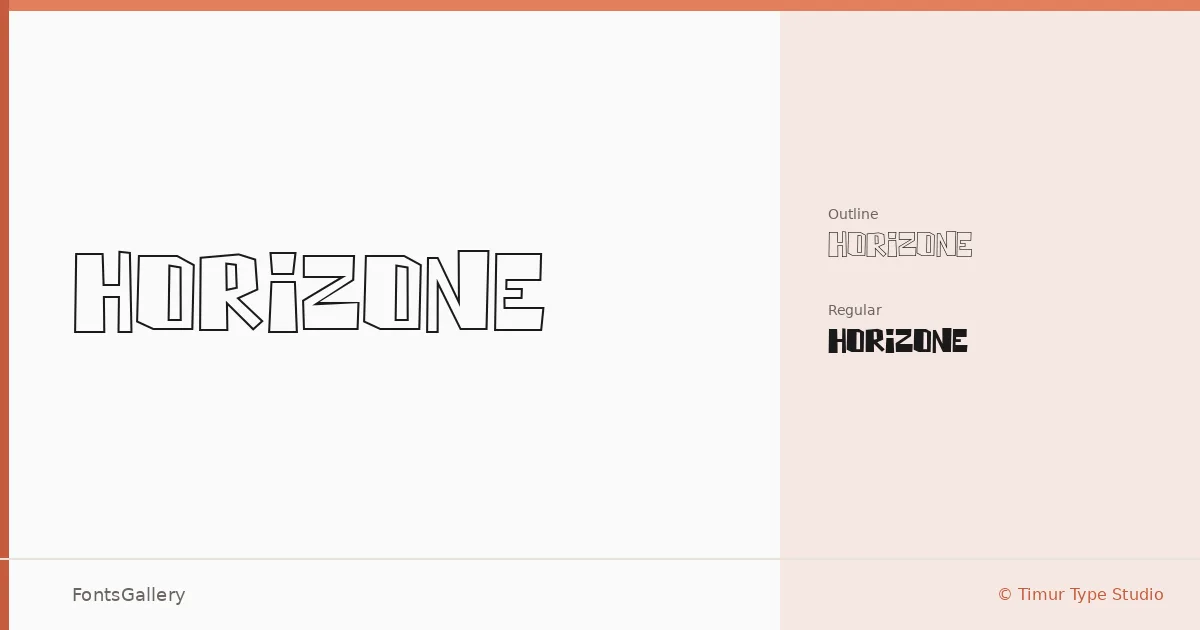
About Horizone Font
There is a hard-edged confidence to these letterforms — the kind of geometry that reads as intentional rather than incidental. Horizone comes from Timur Type Studio and ships in two cuts: a solid Regular and a companion Outline, both in OTF format. The outline version adds a stripped-back, almost architectural quality to the same underlying structure.
Design Aesthetics & Character Characteristics
This is a display face built around a futuristic, modern sensibility with enough visual weight to anchor a composition on its own. The two styles — Regular and Regular Outline — work as a natural pair, letting you layer or contrast within a single design system. The forms lean bold and geometric, the kind of type that holds its shape at large sizes without softening into something decorative.
Recommended Usage & Font Pairing
It earns its keep in headline work, branding systems, logo lockups, poster layouts, and apparel graphics where strong silhouette matters. For pairing, the neutrality of Helvetica or Bahnschrift balances the display energy well, while Canela, Etna, and AQUA each offer a different tonal contrast depending on whether the surrounding design calls for editorial softness or further structural tension.
License & Usage Terms
This family is released under Personal Use terms — commercial use is not permitted, so confirm licensing directly with Timur Type Studio before applying it to any client or commercial work. The font carries installable embedding permission.