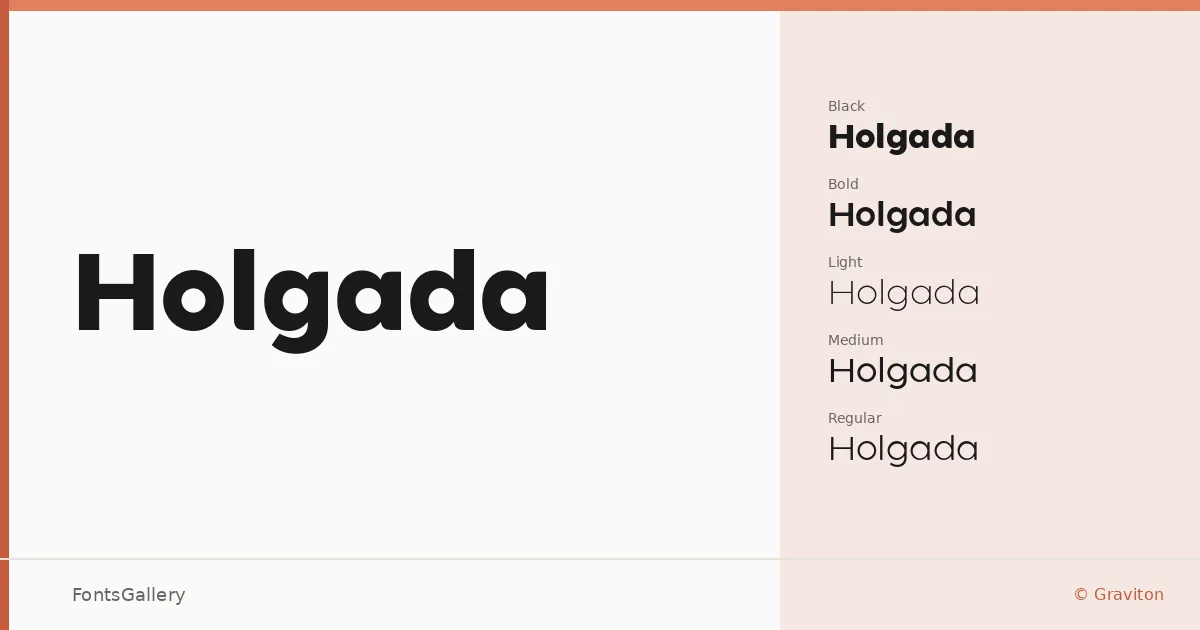
About Holgada Font
There is a particular composure to this sans serif — the kind that comes from careful spacing and proportions that never feel rushed. Pablo Balcells, designing under the Graviton banner, built the family across twelve styles: Thin through Black, each with a matching italic. The letterforms carry an elegance that reads as restrained rather than cold, with clean terminals and a geometric sensibility that holds up at both display and text sizes.
Design Aesthetics & Character Characteristics
Holgada sits in that productive zone between minimal and professional — not a neutral workhorse, but a face with enough personality to anchor a brand identity. The italic cuts are genuinely inclined rather than mechanically sloped, lending warmth to the more expressive end of the weight range. Delivered in OTF format, the full span from Thin Italic to Black Italic gives art directors real room to build typographic hierarchy within a single family. The overall mood is modern without leaning on any single period reference.
Recommended Usage & Font Pairing
The heavier weights are built for headline and logo work — branding systems, magazine covers, and website headers where the type needs to hold attention without shouting. Remarkably, the family covers Latin, Cyrillic, Hebrew, and Arabic, which makes it a serious candidate for multilingual editorial and branding projects. It pairs well with serif and display companions including Canela, Armelie, 321 Impact, AQUA, and Kactigona, offering contrast options ranging from editorial grace to expressive impact.
License & Usage Terms
This family is released under Personal Use terms and does not allow commercial use — confirm licensing with Graviton before deploying it in any client or commercial context. Embedding is limited to preview and print only.