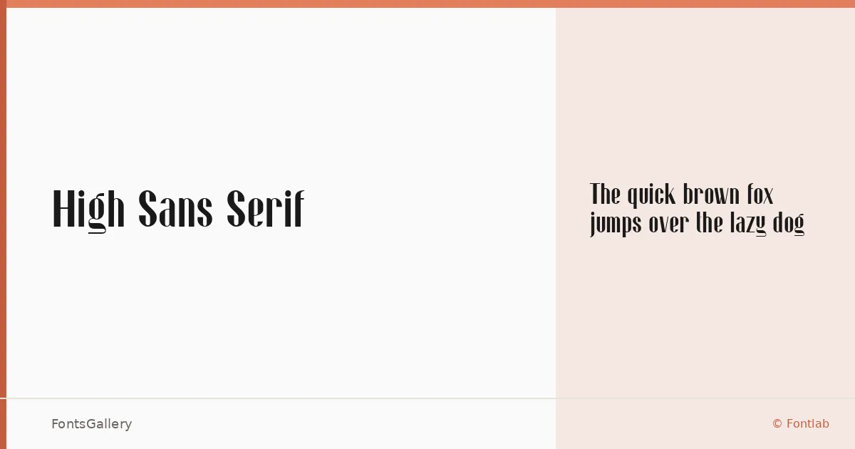
About High Sans Serif Font
There is a deliberate tension in this face — the geometry reads modern and clean, yet the proportions carry a weight that feels considered rather than mechanical. It comes from designer Zamroni Hamzah under the Sensatype Studio trademark, and what stands out immediately in the capitals is a confidence in spacing that gives headlines genuine presence without forcing the issue.
Design Aesthetics & Character Characteristics
A single-weight sans serif available in Regular, it sits firmly in the elegant and luxurious end of the modern spectrum — the kind of cut that earns its place in branding work by doing less, not more. The letterforms are controlled and upright, with a boldness of intention that doesn't rely on heavy stroke contrast to assert itself. Both TTF and OTF formats are included.
Recommended Usage & Font Pairing
The face is built for Latin-script work at display sizes: magazine folios, poster headlines, logo lockups, and brand identity systems where clarity at large scale matters. For text-weight contrast, the listed pairings — Canela, Armelie, 321 Impact, AQUA, and Kactigona — each offer a different kind of friction against its clean geometry, from editorial serif warmth to expressive display energy.
License & Usage Terms
High Sans Serif is released under Personal Use terms, which means commercial use is not permitted — confirm licensing directly at sensatype.com before taking it into a paid project. The font is licensed with installable embedding permission.