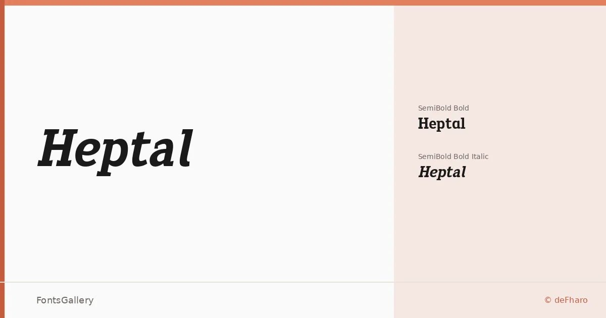
About Heptal Font
There is something immediately arresting about the serifs here — they are not the bracketed wedges you expect from a slab but polygonal, concave forms that invert inward like a Tuscan cut filtered through neo-gothic geometry. Fernando Haro of deFharo built this family around that distinctive structural idea, pairing it with carefully calibrated proportions, meticulous kerning, and a full set of lowercase alternates backed by advanced OpenType features.
Design Aesthetics & Character Characteristics
The family sits in slab serif territory but carries a modern, almost architectural edge — classical in its structural logic yet driven by sharp, unconventional details that read as thoroughly contemporary. Available in two cuts, SemiBold Bold and SemiBold Bold Italic, both delivered as TTF files, the weight range is deliberately concentrated at the heavier end, which gives the forms a bold, professional density. Spacing and optical stain are compensated across the set so text sits evenly whether you are running a single display line or a short editorial deck. Latin script is supported at partial coverage.
Recommended Usage & Font Pairing
The concentrated weight and neo-gothic character make these cuts well suited to headlines, poster work, logo lockups, branding identities, and magazine display — anywhere that demands presence and a degree of classical authority. For a clean contrast pairing, Helvetica or Bahnschrift supply a neutral grotesque counterweight, while Etna and Kactigona offer more textured alternatives; Armelie can introduce an elegant contrast in lighter editorial contexts.
License & Usage Terms
This family is released under Personal Use terms (FFP) — commercial use is not permitted under the download license, and embedding is restricted, so confirm your usage requirements and purchase a commercial license at defharo.com before taking it into any client or revenue-generating work.