About Helena Font
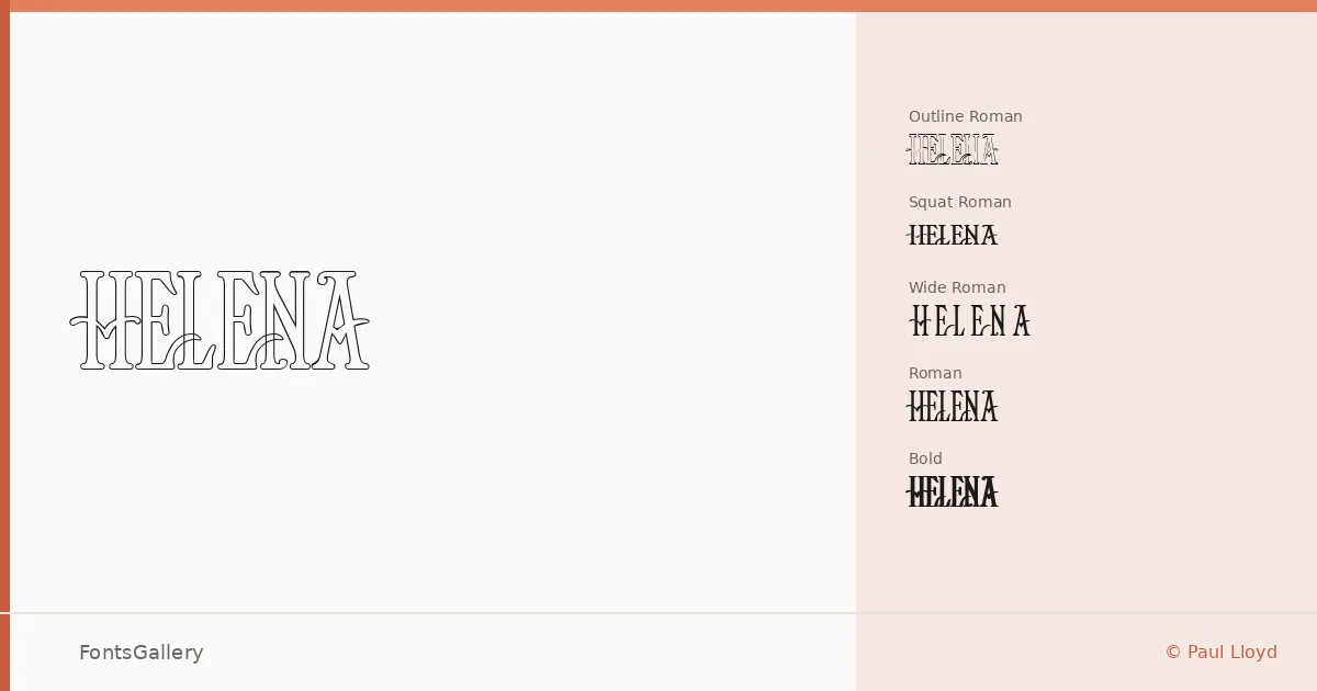
There is a deliberate weight and composure to these serifs — the kind of confidence you find in editorial type from an earlier era, carried forward without apology. Paul Lloyd drew this family, with a copyright dating to 1996, and the result is a display serif with a classic roman structure that feels genuinely considered rather than assembled. The letterforms hold their ground at large sizes, which is exactly where they are meant to live.
Design Aesthetics & Character Characteristics
The family ships as five TTF cuts that each pull the roman silhouette in a distinct direction: a standard Roman, a Bold, a Wide Roman that opens the proportions with a stately horizontal emphasis, a Squat Roman that compresses them into something more grounded and punchy, and an Outline Roman that traces the same structure in negative space for layering or contrast work. Across all five, the mood stays consistent — elegant and vintage in bearing, bold in intention. These are not text faces; they are headline instruments built for scale.
Recommended Usage & Font Pairing
The natural territory here is anywhere a headline needs gravitas: poster campaigns, magazine covers, logo lockups, and brand identity work where a classic sensibility is the whole point. The Outline cut opens up options for layered poster design or display treatments that need a lighter visual touch without losing the underlying character. For pairing, the family works alongside Etna, Armelie, Kactigona, and Bahnschrift for contrast, or beside Helvetica when you want a clean, no-nonsense sans to anchor the body text beneath it.
License & Usage Terms
Helena is available for commercial use, and the TTF files carry installable embedding permissions, so you can deploy them in documents and applications without restriction under those terms.