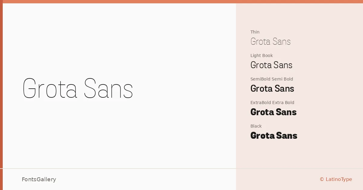
About Grota Sans Font
There is a confident looseness to these letterforms — a grotesque structure that carries what designers at LatinoType describe as a Latin spirit, keeping the forms lively rather than rigidly geometric. Eli Hernández shaped this family as a companion to Grota Unicase, and the result is a sans that feels grounded in editorial tradition while moving with contemporary ease. The OTF files are well-built, and the range is genuinely substantial.
Design Aesthetics & Character Characteristics
The family spans Thin through Black — ten weights in all, each with a matching Italic — and every one of those weights comes in both a standard cut and an Alt version, giving you forty styles total to work across. That Alt track offers alternate letterforms throughout the weight range, a useful tool when a headline or logotype needs a slightly different personality without switching typefaces entirely. The mood sits comfortably in modern and professional territory: minimal enough for clean business contexts, substantial enough at the heavy end to anchor a bold headline.
Recommended Usage & Font Pairing
The weight spread and crisp Latin-script coverage make this a strong candidate for branding work, magazine layouts, website headers, and business cards where hierarchy needs to be established through weight contrast alone. The Alt styles add flexibility when a single logo lockup demands something a touch more distinctive. For pairing, the family has been matched with Canela, Armelie, Minecraft, AQUA, and Kactigona — a spread that suggests it works equally well alongside refined serifs and more expressive display faces.
License & Usage Terms
Grota Sans is offered under a Personal Use license, which does not permit commercial use — confirm licensing terms with LatinoType before deploying it in any client or revenue-generating work. The font is licensed with installable embedding permissions.