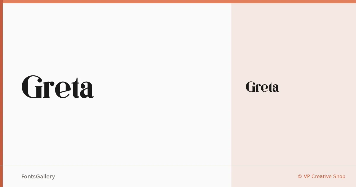
About Greta Font
There is a quietness to this serif that earns attention rather than demands it — the kind of restraint that takes confidence to pull off. Drawn by VP Creative Shop, it arrives as a single Regular weight in OTF format, a focused offering that says the designer knew exactly what this face was for and stopped there.
Design Aesthetics & Character Characteristics
The letterforms sit in classic serif territory while carrying a modern clarity that keeps them from feeling stiff or archaic. The overall mood leans toward luxury and elegance without tipping into ornament — there is nothing extraneous here. That economy of detail is precisely what makes the Regular cut read well at headline scale, where every curve and terminal has room to be noticed.
Recommended Usage & Font Pairing
It belongs on book covers, in magazine headlines, and inside branding and logo work where a serif needs to project refinement without shouting. Latin script is supported, though coverage is partial, so check your character requirements against the actual glyph set before committing to a project. For pairing, it holds up well alongside Helvetica and Bahnschrift when you need a clean sans to carry body text, and it makes an interesting combination with script faces like Armelie or the softer texture of Etna and Kactigona when the layout calls for contrast in mood rather than weight alone.
License & Usage Terms
Greta is offered under a Personal Use license, which means commercial use is not permitted — confirm your usage rights before bringing it into any client or revenue-generating work. The font is licensed for installable embedding.