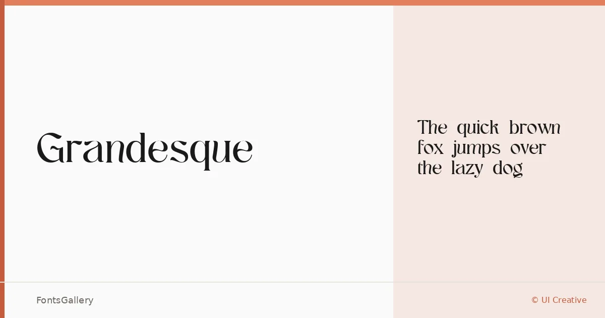
About Grandesque Font
There is a certain composure to these serifs — the kind of deliberate weight and spacing that signals editorial confidence rather than decoration. Grandesque is a serif typeface designed by UI Creative, available in a single Regular cut in both TTF and OTF formats. The letterforms carry a classic structure with enough refinement to read as genuinely modern.
Design Aesthetics & Character Characteristics
The mood here sits at the intersection of luxury and restraint — elegant without being ornate, classic without feeling dated. As a single Regular weight, it asks to be set at sizes where its serif details can breathe: display headlines, logotypes, and editorial titles rather than running body text. The Latin character set is clean and purposeful, built for contexts where the type itself does the positioning work.
Recommended Usage & Font Pairing
The natural territory for this face is anywhere a brand or publication needs to project authority — book covers, magazine headers, logo treatments, and website hero text all sit well within its range. For pairing, the neutrality of Helvetica or Bahnschrift provides a strong sans counterpart, while Armelie, Etna, and Kactigona each offer more expressive contrasts depending on the tone of a project.
License & Usage Terms
This family is released under Personal Use terms — commercial use is not permitted, so confirm licensing with UI Creative before deploying it in a client or commercial context. Embedding is set to installable.