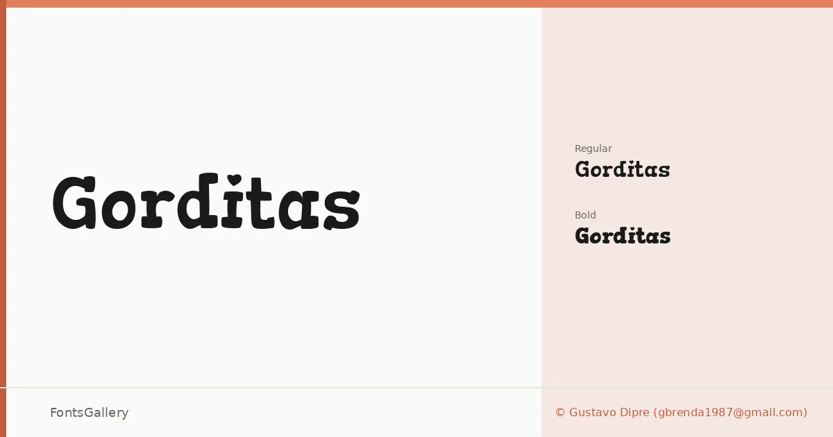
About Gorditas Font
There is a satisfying heft to these slabs — chunky serifs that plant themselves firmly on the baseline without tipping into rigidity. Gustavo Dipre drew this Latin slab serif family with a warmth that keeps the weight from feeling oppressive, giving the letterforms a rounded, almost approachable quality even at their heaviest.
Design Aesthetics & Character Characteristics
The family arrives in two cuts — Regular and Bold — both delivered as TTF files. The mood sits somewhere between classic editorial authority and outright playfulness, a combination that reads as vintage without being nostalgic in a heavy-handed way. Stroke contrast is present but controlled, and the serifs carry enough mass to anchor a composition at display sizes without losing legibility when the point size drops.
Recommended Usage & Font Pairing
These forms are built for headline work: poster typography, magazine cover lines, branding wordmarks, and logo lettering where the slab structure signals confidence and character. The Latin coverage handles the expected range of Western European editorial and commercial work comfortably. For contrast pairings, the family has been noted alongside clean sans options like Helvetica and Asap, and it holds its own next to the script warmth of Armelie or the more expressive shapes of Kactigona and Etna.
License & Usage Terms
Gorditas is released under the SIL Open Font License, Version 1.1, which allows commercial use — full terms and the accompanying FAQ are available at http://scripts.sil.org/OFL. Embedding is permitted at the installable level, so the fonts travel well inside documents and applications.