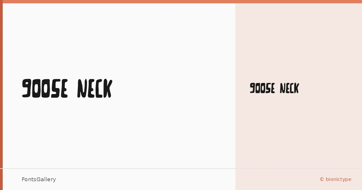
About Goose Neck Font
There is something deliberately rough about this display face — the kind of hand that looks like it was scratched out fast, with intent. Created by Johnw and released through bionictype, it carries a grunge sensibility that feels rooted in the worn edges of vintage print culture. The single cut, a Thin Regular weight, keeps the family lean and purposeful rather than sprawling.
Design Aesthetics & Character Characteristics
This is a display typeface built for impact at large sizes, where its playful, bold personality can breathe. The letterforms lean into a vintage aesthetic without becoming a pastiche — there is genuine character in the irregularities, the kind that reads as handmade rather than distressed-by-algorithm. Available as a TTF, it delivers that grunge texture reliably across design environments. The thinness of the Regular weight gives it an unexpected lightness for something so visually assertive.
Recommended Usage & Font Pairing
It earns its keep in headline treatments, poster layouts, logo work, and anywhere branding needs a raw, expressive edge — t-shirt graphics especially benefit from that vintage roughness at scale. For body copy or supporting text, pairing it with the clean rationalism of Helvetica or Asap provides welcome contrast, while Canela or Etna can add an editorial softness alongside it. AQUA offers a bolder, more graphic counterpoint if the design calls for it.
License & Usage Terms
Goose Neck is available for commercial use at no cost under a freeware license — embedding is permitted at the installable level. If you redistribute it, keep the original readme file inside the archive, and keep it free.