About Gobold Font
There is something immediately architectural about these letterforms — tight geometry, flat terminals, and a confidence that reads from across the room. Situjuh Nazara of Situjuh Font built this family around a bold, futuristic skeleton that holds its structure whether you are setting a single word or filling a poster grid. The Latin character set is handled cleanly throughout the collection.
Design Aesthetics & Character Characteristics
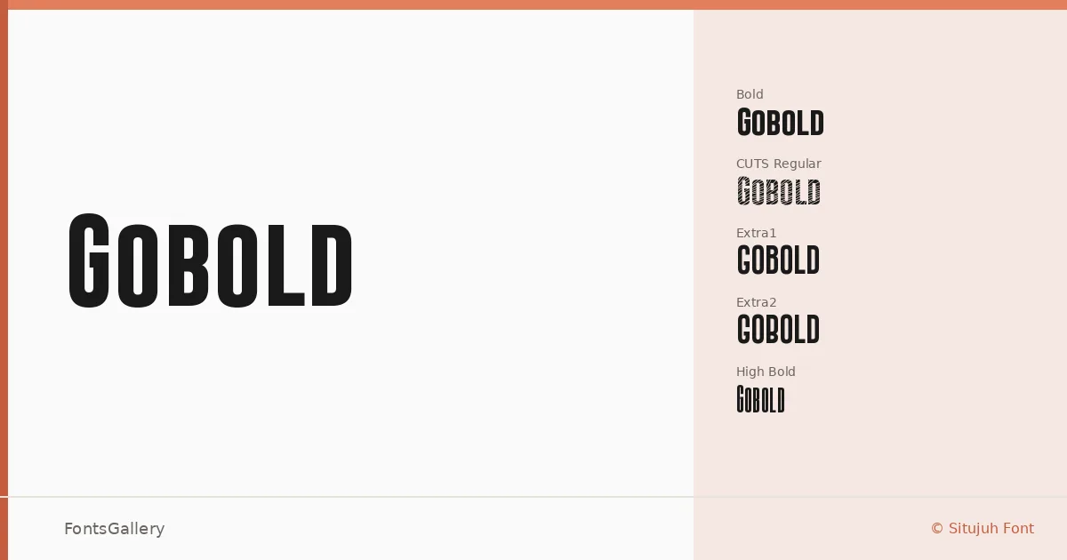
This is a display family in the most committed sense: every decision in the forms pushes toward impact rather than extended reading. The collection runs deep — from Thin and Thin Light through the core weights, Bold, and into structural variants like High, High Bold, and High Thin, each with matching italics, plus the inline Hollow cuts and the notched CUTS and Extra1/Extra2 alternates, and the staggered cap-line treatments in Uplow and Lowplus. That breadth means you have distinct silhouettes to work with, not just weight differences. The mood across all of them stays consistently modern and professional, with a futuristic edge that never tips into novelty.
Recommended Usage & Font Pairing
The family is built for headline work: brand identities, logotypes, poster headlines, and T-shirt graphics where the type needs to carry weight on its own. The hollow and cuts variants are particularly useful when a headline needs visual texture without reaching for illustration. For pairing, the designers behind the specimens have matched it with Etna, Canela, Helvetica, AQUA, and Bahnschrift — a range that covers editorial contrast, clean sans neutrality, and decorative counterpoints depending on the project.
License & Usage Terms
Gobold is available under personal-use terms at no cost; before placing it in any commercial work — branding, client deliverables, merchandise — you will need to contact Situjuh Nazara directly at c7nazara[at]gmail.com to arrange a commercial license. Embedding is permitted at the editable level.