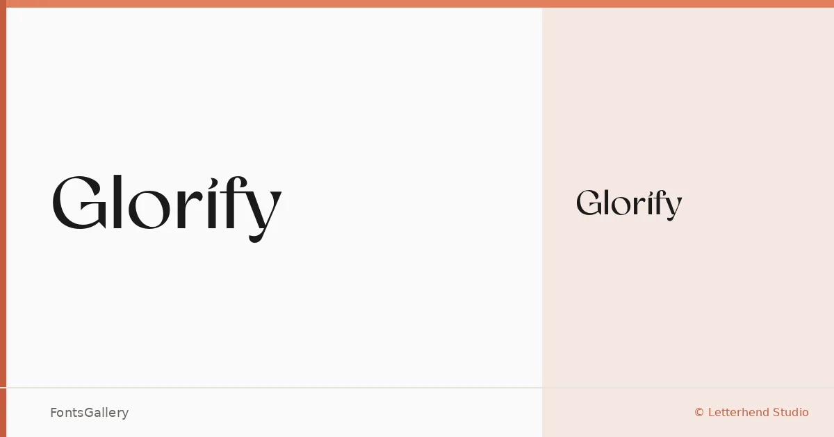
About Glorify Font
There is a deliberate refinement to the serifs here — the kind of careful bracketing and contrast between thick and thin strokes that signals a designer who has thought seriously about elegance rather than just gesture toward it. This is the work of Letterhend Studio, released in 2021, and it carries the measured confidence you expect from a studio with a clear editorial sensibility.
Design Aesthetics & Character Characteristics
A serif with a modern disposition, it sits comfortably in the space between classic structure and contemporary restraint — the sort of face that reads as luxury without becoming decorative excess. The family ships as a single Regular weight in OTF format, which means it works best where one well-chosen cut is enough: a logotype lockup, a magazine headline, a poster where the letterforms carry the whole composition. The high stroke contrast gives it presence at display sizes, and the clean construction keeps it from feeling overwrought.
Recommended Usage & Font Pairing
This is a face for branding work, logo design, editorial headers, and poster typography where a classical yet modern tone is the brief. It earns its place as a website header too, particularly on pages where the visual language leans toward luxury goods, fashion, or lifestyle. Letterhend Studio suggests pairing it with Etna, Armelie, Kactigona, Helvetica, or Bahnschrift — that range of companions, from expressive script faces to clean sans-serifs, shows how well it anchors a typographic hierarchy.
License & Usage Terms
This family is offered under a Demo license, which covers personal use only — confirm licensing terms directly with Letterhend Studio before committing it to any commercial project. Embedding is permitted at the installable level.