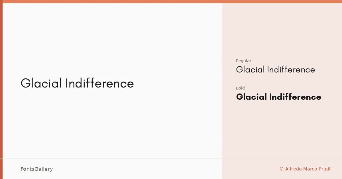
About Glacial Indifference Font
There is a particular kind of calm in a sans-serif that refuses to shout — even spacing, low contrast, letterforms that hold their ground without asserting themselves. Designed by Alfredo Marco Pradil, this family achieves exactly that: a clean geometric character that sits comfortably at large display sizes without feeling cold or clinical.
Design Aesthetics & Character Characteristics
The family delivers a minimal, modern, and professional tone across its two cuts — Regular and Bold — both available as OTF files. The Regular is light-footed enough for editorial contexts where elegance matters, while the Bold adds quiet authority without breaking the overall restraint of the design. Latin character coverage keeps the scope focused but entirely sufficient for most contemporary branding and publishing work.
Recommended Usage & Font Pairing
The design is well-suited to website headers, logo lockups, magazine layouts, and presentation decks — anywhere a professional and minimal voice is the brief. It pairs naturally with contrasting textures: the editorial weight of Canela or ABC Arizona, the warmth of Armelie or Angeletta, or the blocky personality of Minecraft for projects that need a harder edge.
License & Usage Terms
Glacial Indifference is released under the SIL Open Font License (OFL), which permits commercial use freely; note that the font name itself is a reserved trademark of Alfredo Marco Pradil, so any modified versions must be distributed under a different name.