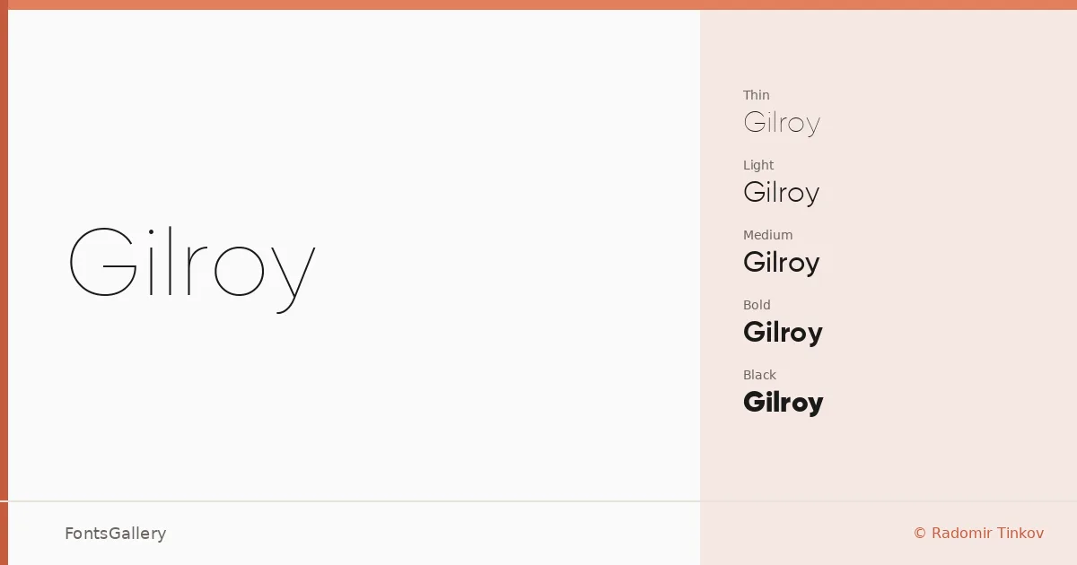
About Gilroy Font
There is a quiet confidence to this geometric sans-serif, designed by Radomir Tinkov. The curves are full but controlled, the stems clean, and the overall proportions sit somewhere between the warmth of humanist design and the discipline of pure geometry. It carries weight without effort across its full span from Thin to Heavy.
Design Aesthetics & Character Characteristics
The family runs twenty cuts — Thin through Heavy, each with a matching italic — giving you a complete palette for editorial and branding work where tonal contrast matters. The lighter weights feel airy and minimal, well-suited to open layouts, while the ExtraBold, Black, and Heavy cuts command attention in headline settings without resorting to aggressive condensing or unusual proportions. Throughout, the forms stay modern and professional, with a geometric regularity that holds up equally well in both Latin and Cyrillic settings. Files are distributed in TTF format.
Recommended Usage & Font Pairing
The elegance of the lighter weights makes it a natural fit for branding identities, magazine layouts, and website headers, while the heaviest cuts handle logo lockups and display headlines with ease. For pairing, the family works in contrast with serif companions like Canela or the script warmth of Armelie, and can be pushed into more expressive territory alongside 321 Impact, AQUA, or Kactigona.
License & Usage Terms
This family is offered under Personal Use terms, which means commercial use is not permitted — confirm licensing before deploying it in any client or revenue-generating work. Embedding is restricted to preview and print only.