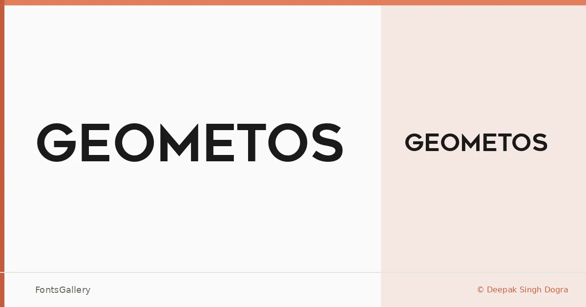
About Geometos Font
There is a deliberate confidence to these letterforms — wide, evenly weighted, built on geometric logic that keeps every character grounded and clear. The family is the work of Deepak Singh Dogra, released under his own foundry. A single Regular cut is available in TTF format, and it is enough: the design does not rely on a range of weights to make an impression.
Design Aesthetics & Character Characteristics
This is a sans serif drawn in a modern, minimal register, where circular forms and consistent stroke widths give the type a clean, professional authority. The geometry is unapologetic — you can feel the underlying grid in every capital, which is precisely what makes it feel so resolved at large sizes. With just the one Regular style, the character has to do all the work, and it does.
Recommended Usage & Font Pairing
The design is at home in branding, logo work, poster headlines, and website headers — contexts where bold, minimal Latin typography needs to read instantly from a distance or at a glance. It carries the kind of structural weight that makes it a strong anchor typeface. For contrast, the listed pairing suggestions span a range of moods: the refined editorial quality of Canela or ABC Arizona, the calligraphic softness of Angeletta or Armelie, and the blocky retro character of Minecraft all offer productive counterpoints to its strict geometry.
License & Usage Terms
Geometos is available under Personal Use terms only, which means commercial use is not permitted — confirm licensing with the designer before applying it to any client or revenue-generating work. Embedding is restricted to preview and print only.