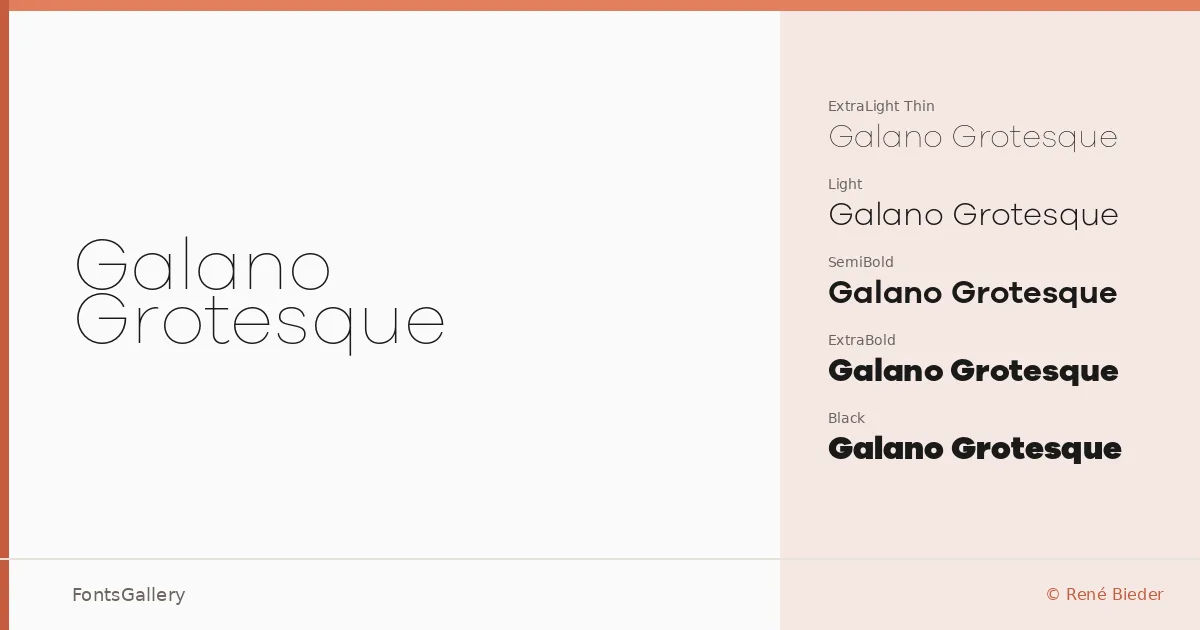
About Galano Grotesque Font
There is a quiet confidence to the spacing and stroke weight here — the kind of geometric grotesque that holds its shape whether it is set large across a magazine spread or small in a navigation bar. René Bieder drew this family with a precision that sits somewhere between the rational and the warm: the terminals are clean, the proportions generous, and nothing feels pinched. The alternate cuts add a second layer of character without breaking the overall system.
Design Aesthetics & Character Characteristics
This is a geometric sans serif built for modern, professional work, with a minimal elegance that reads as considered rather than cold. The family spans Thin through Black — nine weights in total, each available in both a standard and an Alt variant, and every weight paired with a true italic — giving you forty cuts in OTF format to move across. The Alt styles offer subtle single-storey and open-form alternatives that shift the mood from strictly neutral toward something a touch more editorial, all within the same disciplined skeleton.
Recommended Usage & Font Pairing
The weight range makes it well suited to branding systems, logo lockups, and website headers where hierarchy needs to be built from a single family without relying on contrasting typefaces. Magazine layouts benefit from the lighter weights at text size and the heavier cuts in display, keeping a consistent voice across the page. The Latin coverage covers Western European editorial and branding work comfortably. For contrast pairings, it has been matched with Canela, Armelie, Urban Thunder Demo, AQUA, and Kactigona — each bringing texture or personality that plays well against the family's cleaner geometry.
License & Usage Terms
This family is released under Personal Use terms, which means commercial use is not permitted — confirm licensing directly with René Bieder at renebieder.com before deploying it in a paid project. Embedding is set to editable.