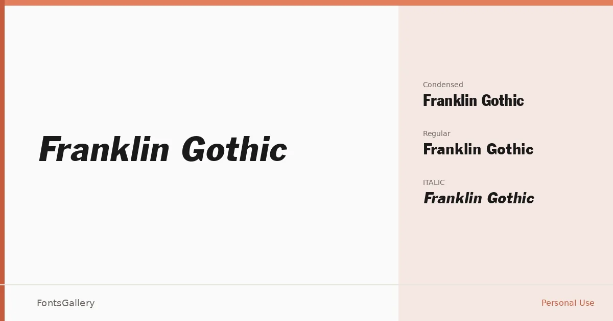
About Franklin Gothic Font
There is a reason this sans-serif has anchored American editorial and advertising typography for well over a century — the strokes carry real weight without tipping into aggression, and the proportions feel resolved rather than engineered. The family here arrives in three cuts: a Regular, a Regular Italic, and a Regular Condensed, all delivered as TTF files bearing a 1991 Digital Typeface Corp. copyright.
Design Aesthetics & Character Characteristics
Classic and professional are the operative words, though neither quite captures how quietly bold this face reads on a page. The upright Regular has the kind of even-tempered authority that holds a headline together without shouting; the Italic adds just enough lean to signal emphasis; and the Condensed earns its keep wherever column inches are tight but the type still needs presence. Latin-script coverage runs clean throughout all three styles.
Recommended Usage & Font Pairing
Poster headlines, magazine covers, brand identities, and advertisement campaigns are where these cuts do their clearest work — contexts that reward a modern-feeling structure with a genuinely classic backbone. The Condensed in particular suits tabloid-style headlines or narrow display banners where a wider face would buckle. For contrast pairings, the listed companions span a wide tonal range: the editorial refinement of Canela, the script warmth of Armelie, the decorative personality of AQUA and Kactigona, and the blocky informality of Minecraft, giving you considerable latitude depending on the project's register.
License & Usage Terms
This family is offered under Personal Use terms, which means commercial use is not permitted — confirm licensing before deploying it in any paid or client-facing work. Embedding is set to installable.