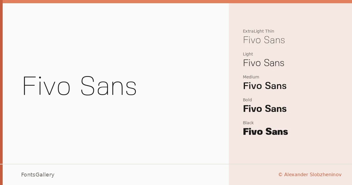
About Fivo Sans Font
There is a particular discipline to this family — clean stroke terminals, consistent proportions, and just enough contrast to hold attention without announcing itself. Alexander Slobzheninov released it in 2017, and the result is a Latin sans serif that earns its place in professional work through restraint rather than novelty. The OTF files are tightly drawn, with geometry that reads as modern without leaning on any single trend.
Design Aesthetics & Character Characteristics
The family spans an unusually wide tonal range: Thin and Thin Oblique at one extreme, through Light, Regular, Medium, Bold, Black, and Heavy — each with a matching oblique — fourteen cuts in total. That breadth is what gives the family its usefulness in editorial and identity contexts. The lightest weights carry an elegant, almost minimal quality; the Heavy and Black end of the range brings real mass, the kind that holds a logo or magazine cover without needing extra size to do it. Every weight shares the same underlying skeleton, so mixing them within a layout feels natural rather than forced.
Recommended Usage & Font Pairing
The family works naturally in branding systems, business cards, website headers, and magazine layouts — anywhere a professional, modern register is needed without decorative distraction. For contrast pairings, it sits well alongside the serif warmth of Canela, the script energy of Armelie, or the expressive weight of 321 Impact; AQUA and Kactigona offer further possibilities when a bolder stylistic counterpoint is wanted.
License & Usage Terms
Fivo Sans is released under the SIL Open Font License (OFL) Version 1.1, which permits commercial use, embedding, modification, and redistribution, provided the font is not sold on its own and any derivative works are distributed under the same license.