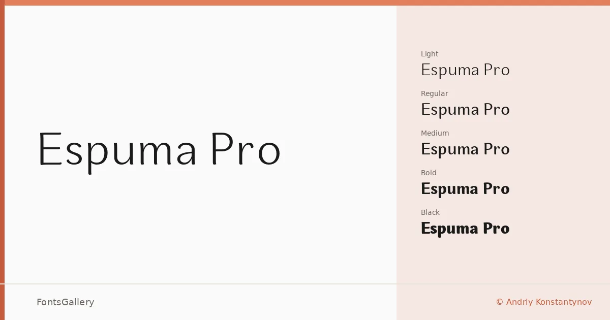
About Espuma Pro Font
There is a quiet confidence to these letterforms — clean stems, open apertures, and a geometric underlying structure that never tips into coldness. Designed by Andriy Konstantynov, this sans serif carries a restrained elegance that rewards careful spacing and considered sizing. Both Latin and Cyrillic scripts are supported, which broadens its reach considerably across European and Slavic-language work.
Design Aesthetics & Character Characteristics
The family runs from Light and Light Italic through Book, Regular, Medium, and SemiBold, on to Bold and Black — each with a companion italic — giving you a genuinely complete range of fourteen OTF cuts to work with. The overall mood sits at the intersection of minimal and professional: strokes are even, contrast is low, and the geometry feels deliberate without becoming rigid. Italics are properly drawn rather than slanted, which keeps the family coherent across mixed typesetting. The Black sits heavy but controlled, making it a credible choice for headline-weight display work alongside the lighter grades used for text.
Recommended Usage & Font Pairing
The range of weights makes it well suited to branding systems, magazine layouts, website headers, and business card design where a modern, professional tone is required. For pairings, the family works well alongside Canela, ABC Arizona, and Armelie when you need a contrasting serif or script, and alongside 321 Impact or Kactigona when the project calls for something with more expressive weight. Cyrillic support makes it a practical choice for bilingual editorial and identity work.
License & Usage Terms
Espuma Pro is available under Personal Use terms — commercial use is not permitted, so confirm licensing directly with the designer before committing it to a client job. Embedding is restricted to preview and print only.