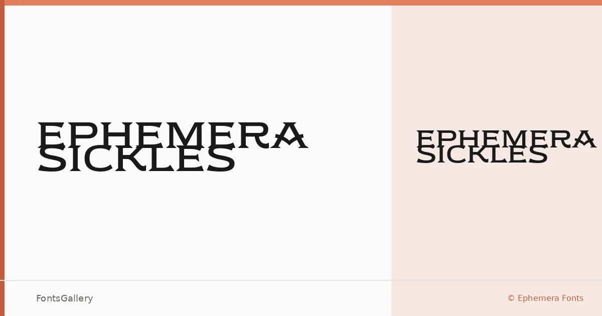
About Ephemera Sickles Font
There is a solidity to these slab serifs that commands attention before a single word is read — the bracketing is deliberate, the stroke weight confident without tipping into aggression. Gilang Purnama and Ilham Herry at Ephemera Fonts built this face with a classic, vintage sensibility that still reads as composed and professional in contemporary contexts. The single cut available is Ephemera Sickles Block — Regular Block, delivered in OTF format.
Design Aesthetics & Character Characteristics
The family sits firmly in the slab serif category, carrying a bold, vintage character that calls to mind hand-lettered display work from an earlier era of printing. Despite that historical warmth, the construction is clean enough to hold up in strictly professional settings — think editorial headers rather than novelty display. Latin coverage is the focus, and the letterforms are drawn with that constraint in mind: each glyph is resolved rather than rushed.
Recommended Usage & Font Pairing
This is a headline and poster face first — the weight and personality make it well suited to branding, logo lockups, and magazine covers where a single word needs to carry real presence. It pairs with a range of companion typefaces: the geometric clarity of Helvetica or Bahnschrift can anchor it technically, while Etna, Armelie, and Kactigona offer more expressive contrast for editorial or identity work.
License & Usage Terms
Ephemera Sickles is released under Personal Use terms, meaning commercial use is not permitted — confirm licensing directly with Ephemera Fonts at Ephemerafonts.com before deploying it in a paid project. The OTF file is set to editable embedding permissions.