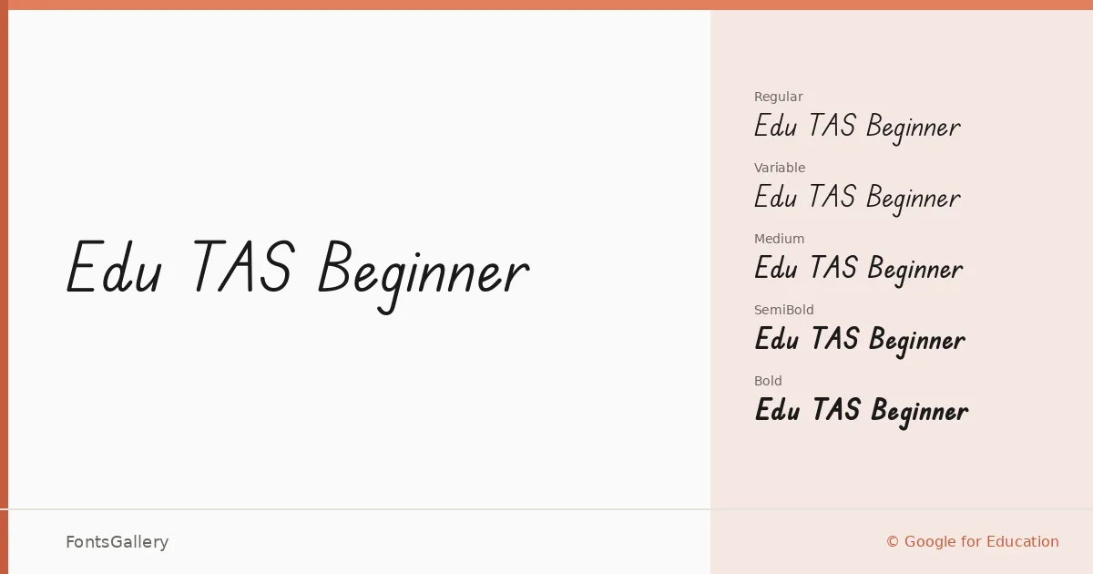
About Edu TAS Beginner Font
There is a careful, unhurried quality to these letterforms — the kind of deliberate stroke rhythm you see when a child is just learning how a letter is supposed to sit on the line. Tina and Corey Anderson developed this family through the AU School Handwriting Fonts Project under Google for Education, modeling the specific handwriting style prescribed by the Tasmanian curriculum for beginning writers. Every curve and join reflects an instructional intent rather than a casual stylistic choice.
Design Aesthetics & Character Characteristics
Sitting squarely in the handwritten category, the family carries a classic yet playful and genuinely whimsical character — warm without being sloppy, structured without feeling mechanical. The weight range runs from Regular through Medium, SemiBold, and Bold, with a variable font included alongside the static TTF cuts, giving you smooth interpolation across the full weight span. The letterforms stay open and legible even at smaller sizes, which matters when the audience reading them is still building their own relationship with the alphabet.
Recommended Usage & Font Pairing
The natural territory here is anywhere a handcrafted, approachable tone carries meaning: children's books, greeting cards, classroom certificates, and educational presentations all benefit from its grounded informality. For contrast, it pairs well with the editorial confidence of Canela or ABC Arizona, the clean neutrality of Helvetica, and the distinct personalities of AQUA and Etna — each option offering a different register of formality against the script's warmth.
License & Usage Terms
Edu TAS Beginner is released under the SIL Open Font License, Version 1.1, which permits commercial use. The font is licensed with installable embedding permissions; full license terms are available at https://scripts.sil.org/OFL.