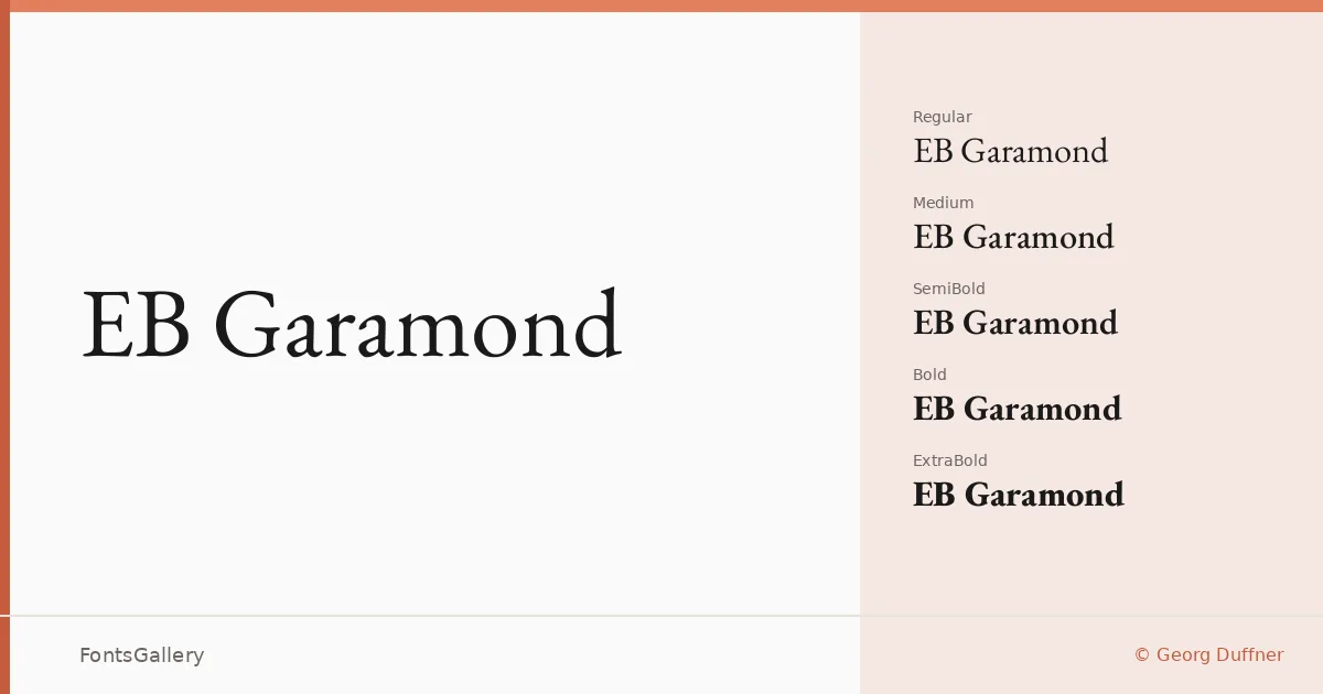
About EB Garamond Font
There is a particular quietness to these letterforms — the long, tapered serifs, the slightly cupped bracketing, the way the lowercase sits with confident but unhurried proportion on the line. This is an open-source revival of the sixteenth-century Garamond types, developed by Georg Duffner and Octavio Pardo, and it reaches well beyond a straightforward historical copy. The project draws on early printed sources to recover the warmth and optical subtlety that mechanical reproduction tends to flatten out.
Design Aesthetics & Character Characteristics
The family is a classical humanist serif with a vintage elegance that reads as professional without feeling stiff. Styles run from Regular and Italic through Medium, SemiBold, Bold, and ExtraBold — each with a matching italic — plus variable and variable italic files for continuous weight control, all delivered as TTFs. The italics have genuine personality, with angled stress and lively terminal detail that distinguishes them from simply sloped romans. Across every weight the color on the page stays remarkably even, which is what you want from a face rooted in the book tradition.
Recommended Usage & Font Pairing
The range of weights makes it useful across book covers, editorial headlines, certificates, and branding work where a classic, historically grounded voice is right. Language support covers Latin, Latin Extended, Vietnamese, Cyrillic, and Greek, so it holds up in multilingual publishing contexts. For contrast, the named pairings lean into complementary geometrics and scripts — Helvetica and Bahnschrift offer clean sans neutrality against the serif warmth, while Etna, Armelie, and Kactigona introduce decorative or display energy for layered layouts.
License & Usage Terms
Released under the SIL Open Font License, Version 1.1, with installable embedding permissions — commercial use is explicitly allowed. Full license terms and FAQ are at https://openfontlicense.org.