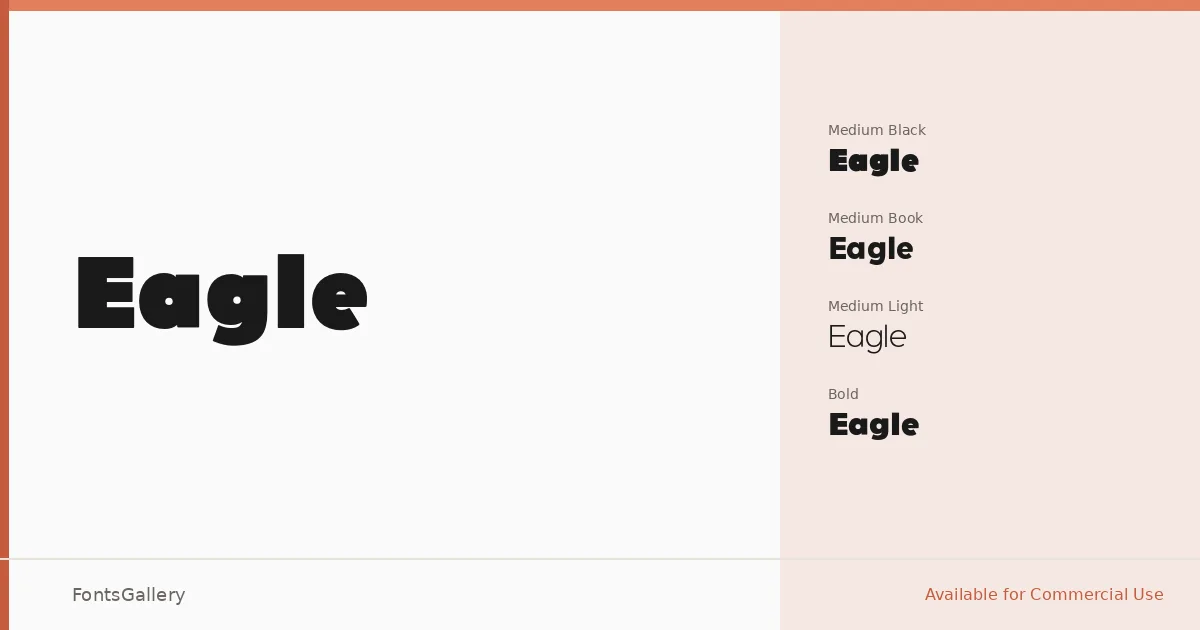
About Eagle Font
There is a directness to this sans serif that earns its name — nothing soft, nothing wasted. Produced by The Font Bureau, Inc. and copyrighted in 1994 by David Berlow, it carries the confident geometry of a face built for impact rather than apology. The letterforms are clean and upright, with a structure that reads just as clearly at display scale as it does tighter and smaller.
Design Aesthetics & Character Characteristics
The family spans four weights — Light, Book, Bold, and Black — giving it a useful range from restrained to commanding without ever losing its minimal, professional composure. All four cuts are delivered as OTF files with installable embedding permissions, covering Latin-script copy. The heavier weights carry real mass; the Light holds its own without feeling fragile. Across the range, the mood stays consistently modern and spare.
Recommended Usage & Font Pairing
This is headline and poster work at its most focused — equally at home anchoring a branding system, driving a logo lockup, or headlining an advertisement where the type needs to do the convincing on its own. The listed pairing families — Canela, Armelie, 321 Impact, AQUA, and Kactigona — each bring a different texture against its neutrality, whether that is an editorial serif warmth or something more expressive and decorative.
License & Usage Terms
Eagle is available for commercial use, and the embedding permission is set to installable, so you can embed it in documents and applications without restriction beyond the license terms.