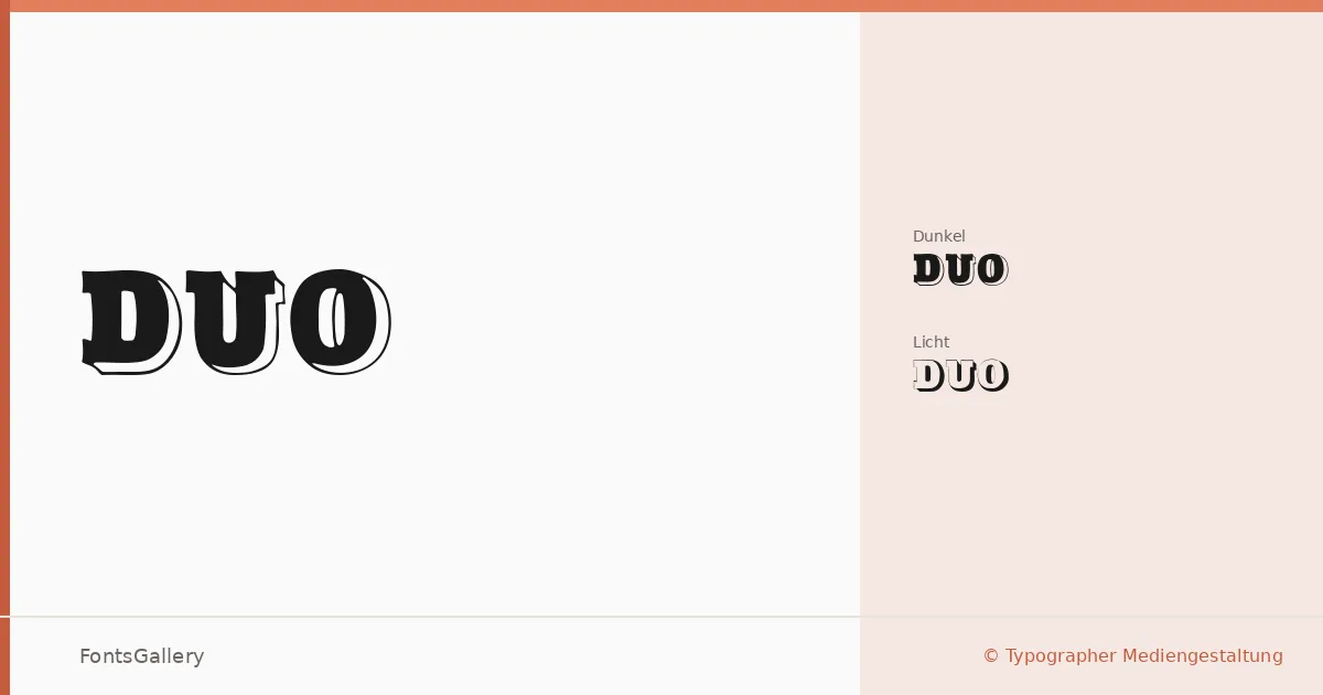
About Duo Font
Two weights, two personalities — Duo Dunkel and Duo Licht read as dark and light counterparts built to work as a system. Designed by Typographer Mediengestaltung, the family carries a confident, classic character that leans into vintage display territory without tipping into pastiche. The contrast between the two cuts is the point: each regular style holds its own, and together they create visual hierarchy by nature.
Design Aesthetics & Character Characteristics
This is a display family in the bold, classic mold — the kind of type that commands a headline before you've finished reading it. The two styles, Regular Dunkel and Regular Licht, are delivered as TTF files and share the same underlying structure, making them a natural pairing within a single layout. The vintage mood means the letterforms carry a little weight and warmth rather than cool geometric precision, suited to work that wants authority and some history behind it.
Recommended Usage & Font Pairing
Branding, poster work, logo lockups, and T-shirt graphics are where these cuts earn their keep — anywhere a headline needs to stop a reader cold. Latin character coverage supports Western European projects. For companion faces, the family sits well alongside Etna, Canela, Helvetica, AQUA, and Bahnschrift, giving you options from refined serif companions to clean neutrals depending on how much contrast the layout demands.
License & Usage Terms
Duo is available for commercial use, and the embedding permission is set to installable, so you can confidently deploy it across documents and applications without restriction.