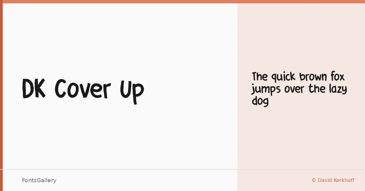
About DK Cover Up Font
There is a loose, hand-inked quality to this script — the kind of mark that looks like it was lettered quickly but with intention, the pen barely lifting between strokes. It comes from David Kerkhoff of Hanoded Fonts, whose catalog tends toward character-driven display work. The letterforms carry a rough, organic edge that reads as genuinely handmade rather than merely styled to look that way.
Design Aesthetics & Character Characteristics
This is a handwritten display face with a playful, rustic, and whimsical character. The family ships as a single Regular weight in OTF format, so the whole personality lives in that one cut — the irregularity of stroke width, the slightly uneven baseline, and the casual connections between letters all doing the expressive work that a range of weights would otherwise handle. It suits Latin-script text and performs best at larger sizes where the hand-drawn texture stays legible and alive.
Recommended Usage & Font Pairing
Children's book covers, greeting cards, poster headlines, social media graphics, and T-shirt designs are the natural territory here — anywhere a human touch and a bit of warmth outweigh the need for strict uniformity. The roughness pairs well with something clean and grounded; from the listed options, Helvetica or Canela provide useful contrast, while AQUA, Etna, and ABC Arizona can complement the casual mood depending on the register you need.
License & Usage Terms
This font is distributed under a Demo license, which carries personal-use terms only — commercial use is not permitted under this version, and webfont embedding requires a separate license from Hanoded, so confirm the appropriate license directly with the foundry before any commercial job.