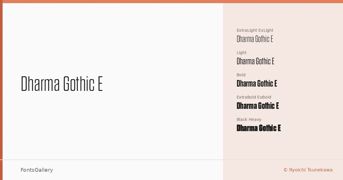
About Dharma Gothic E Font
There is a particular tension in condensed gothic display type — the way tall, tightly set letters hold authority without shouting. Ryoichi Tsunekawa built this family with that tension in mind, producing a gothic display face that reads as both classical and sharply contemporary. The letterforms carry clean, upright construction with disciplined stroke contrast and a composure that holds at large sizes.
Design Aesthetics & Character Characteristics
The family spans ExtraLight through Heavy — eleven cuts in all, including ExtraLight, Light, Regular, Bold, ExtraBold, and Heavy, each accompanied by italics where the weight calls for it — delivered as OTF files. Across that range, the mood shifts from refined and editorial in the lighter weights to bold and commanding as you move toward Heavy. The result is a display family that carries a professional, modern character without sacrificing the classic legibility that headline and branding work demands.
Recommended Usage & Font Pairing
The obvious home for these cuts is wherever scale and impact matter: poster headlines, magazine covers, brand wordmarks, and logo treatments in Latin-language contexts. The lighter weights open up editorial applications where you want presence without weight. It pairs well with Helvetica for a tight, utilitarian combination, or with Canela and ABC Arizona when the brief calls for something with more typographic warmth and contrast; Asap and Etna offer further range depending on the register of the project.
License & Usage Terms
This family is available under Personal Use terms — commercial use is not permitted, so confirm licensing at dharmatype.com before committing it to any client-facing or revenue-generating work. Embedding is limited to preview and print only.