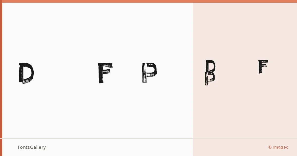
About Decaying Felt Pen Font
There is something immediately physical about this face — the strokes look dragged rather than drawn, as though the marker was running dry halfway through each letter. Created by imagex, it captures the specific texture of a felt-tip pen past its prime: ink pooling in some corners, fading in others, leaving edges that are ragged in exactly the right way.
Design Aesthetics & Character Characteristics
A handwritten display face sitting squarely in grunge and rustic territory, it carries a vintage weight without pretending to be a revival of anything. The family ships as a single cut — Regular Normal in TTF format — so the character comes entirely from the letterforms themselves rather than from weight variation. That rawness is the point: the unevenness reads as deliberate, and it holds attention in branding and poster contexts where a cleaner script would simply disappear.
Recommended Usage & Font Pairing
It earns its keep on posters, t-shirt graphics, social media visuals, and anywhere a brand needs a bold, worn-in handmade quality across Latin-language copy. The contrast pairing list is strong and deliberate — set it against the editorial refinement of Canela or ABC Arizona, the geometric calm of Helvetica, or the distinctive personalities of Etna and AQUA to keep the grunge energy from overwhelming a layout.
License & Usage Terms
This family is available under Personal Use terms — free for personal use only, per the license notes — so confirm licensing with the designer before committing it to any commercial job. Embedding is permitted at editable level.