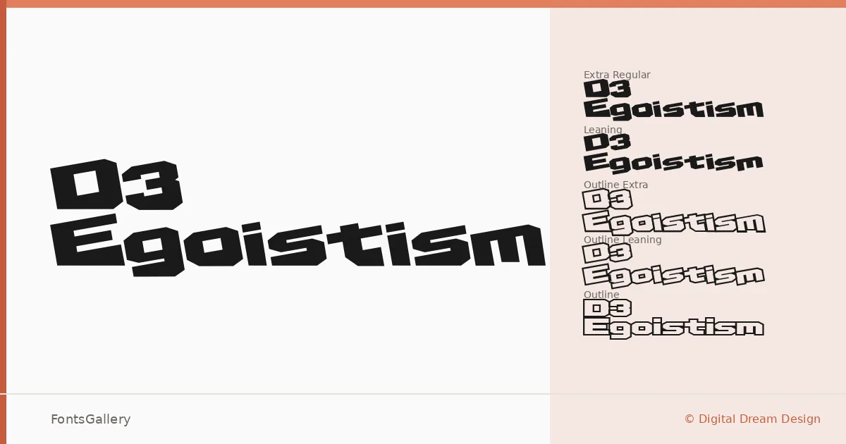
About D3 Egoistism Font
There is a hard, mechanical edge to these letterforms — the kind that feels pulled from circuit boards and industrial stencils rather than calligraphic tradition. Digital Dream Design built this display family with a deliberately angular, compressed character that reads as both futuristic and grunge-inflected, two moods that rarely coexist so naturally. The copyright traces back to 1999–2000, and that era of digital type experimentation is stamped clearly into every glyph.
Design Aesthetics & Character Characteristics
The family ships in six TTF cuts: Regular, Leaning, Extra, Outline, Outline Extra, and Outline Leaning — giving you upright and oblique angles alongside filled and stroked variants, all sharing the same bold, modern skeleton. The leaning cuts introduce a forward-driving tension, while the outline versions open things up without softening the aggressive geometry. Latin coverage keeps the scope focused, and the forms stay consistent and deliberate across every style in the set.
Recommended Usage & Font Pairing
The weight and attitude here point squarely toward headline work, poster layouts, logo marks, and T-shirt graphics — contexts where the type needs to hold its ground at large sizes rather than recede into body copy. The outline variants are especially useful when you need presence without density, as in layered poster compositions or branded apparel where ink coverage matters. It pairs well against the clean geometry of Helvetica or Bahnschrift, the editorial softness of Canela, and the display character of Etna and AQUA, all of which offer useful contrast in weight or warmth.
License & Usage Terms
This family is available for commercial use under its stated license terms. Embedding is permitted for preview and print only, so confirm those constraints before building it into interactive or app-based environments.