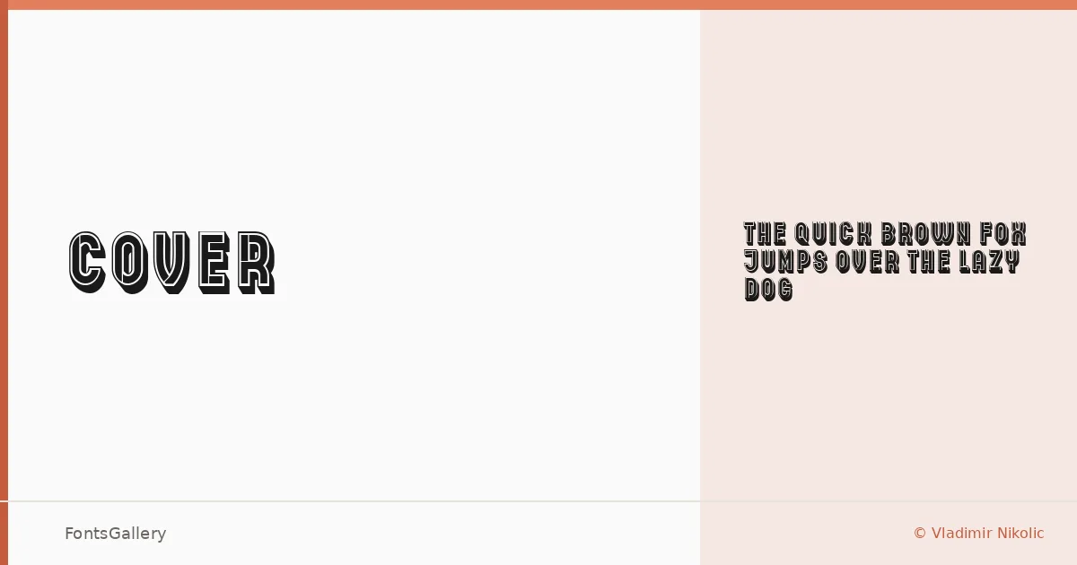
About Cover Font
There is a particular weight and intention to the letterforms here — the kind of deliberate, vintage-inflected authority you find in old book spines and hand-lettered signage. This display face is the work of Vladimir Nikolic, and it arrives as a single cut: Cover Regular.
Design Aesthetics & Character Characteristics
The family sits firmly in display territory, carrying a mood that is bold, rustic, and classically vintage without feeling like a pastiche. The single Regular style is delivered as a TTF, and the forms are built for large sizes — the kind of setting where every curve and terminal gets its moment. There is nothing casual about the stroke decisions; this is a face with a clear point of view.
Recommended Usage & Font Pairing
It earns its keep on book covers, posters, headlines, and logo lockups, and the vintage character translates well to T-shirt design where a strong typographic personality matters. For pairing, the neutrality of Helvetica or Bahnschrift offsets the rustic weight cleanly, while Canela brings a more editorial softness alongside it; Etna and AQUA can reinforce the period sensibility if the project calls for it.
License & Usage Terms
This family is offered under Personal Use terms, which means commercial use is not permitted — confirm licensing directly with Vladimir Nikolic before taking it into any paid work. Embedding is limited to preview and print only.