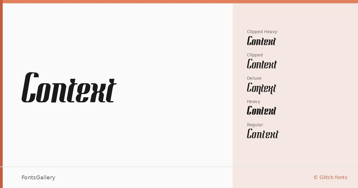
About Context Font
There is something deliberately fractured about this display family — a kind of late-1990s digital restlessness built into every letterform. Koen Hachmang designed it under his Glitch Fonts banner, and the copyright traces back to 1999, which explains the aesthetic entirely. The cuts feel like type that has been photocopied, scrambled, clipped, and reassembled by hand rather than drawn clean from the start.
Design Aesthetics & Character Characteristics
The family ships as seven TTF styles: Regular Regular, Regular Heavy, Regular Deluxe, Regular Clipped, Regular Clipped Heavy, Regular Scrambled, and Regular Scrambled Heavy. That naming convention is its own kind of signal — each variant treats the base forms differently, from the cropped geometry of the Clipped cuts to the deliberately disordered texture of the Scrambled weights. The mood shifts between bold and elegant depending on which style you reach for, carrying a vintage charge that reads as modern interference rather than nostalgia. Latin script only.
Recommended Usage & Font Pairing
It earns its place in headline work, poster layouts, logo treatments, and editorial magazine contexts where a strong, idiosyncratic display voice is the whole point. Branding projects that need an edge without leaning on generic grotesques will find the Heavy and Scrambled cuts particularly useful. For pairing, it holds up well alongside Canela, ABC Arizona, Helvetica, Bahnschrift, and Etna — faces that offer enough contrast in structure or weight to let the display character breathe.
License & Usage Terms
Context is released under a Personal Use license from Glitch Freeware Fonts — commercial use is not permitted without prior permission from the author, so confirm with Koen Hachmang directly before committing it to a paid job. Embedding is set to installable, and any distribution must include a complete, unmodified copy of the font files along with this license.