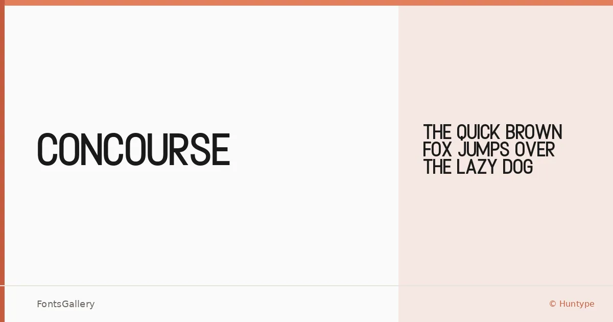
About Concourse Font
There is a clean confidence to the strokes here — the kind of geometry that holds its ground at large sizes without shouting. Mas Anis at Huntype built this single-cut sans serif with a minimal structure that strips away anything decorative, leaving letterforms that feel deliberately composed rather than simply reduced.
Design Aesthetics & Character Characteristics
Sitting squarely in the sans serif category, the family ships as a single Regular weight in both TTF and OTF formats. The mood reads as modern and professional, with a bold presence that comes not from stroke weight alone but from the spatial confidence of each glyph. It is the kind of face that works hardest when given room — set large, with air around it.
Recommended Usage & Font Pairing
This is a headline and display typeface first: think poster campaigns, outdoor signage, brand identities, and advertising layouts where a single strong word or phrase needs to anchor the composition. When the job calls for contrast in a layout, it sits well alongside Canela, Armelie, 321 Impact, ABC Arizona, or Kactigona, each offering a different counterpoint in texture or weight.
License & Usage Terms
Concourse is released under a Personal Use license — free for personal projects, but commercial use is not permitted under these terms, so confirm licensing with Huntype before applying it to any client or revenue-generating work. The font is installable with embedding permissions included.