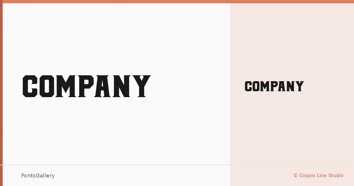
About COMPANY Font
There is something immediately authoritative about these serifs — the kind of slab construction that recalls letterpress trade cards and early commercial printing, filtered through a contemporary sensibility. Aldi Raya Pradipta, designing under the Grapix Line Studio banner, delivers a single Regular weight that earns its keep through sheer presence and structural confidence rather than range.
Design Aesthetics & Character Characteristics
This is a slab serif built for impact, carrying a bold, classic character with strong rustic and vintage undertones. The single Regular cut arrives as a TTF file, and the letterforms are unapologetically heavy in spirit — the kind of shapes that read clearly at large sizes and hold their ground on dark or textured backgrounds. There is no subtlety being chased here; the mood is deliberate, even declarative.
Recommended Usage & Font Pairing
The face is well-suited to branding work, posters, logotypes, and T-shirt graphics — anywhere a headline needs to project confidence without explanation. For body copy or supporting text, pairing it with clean companions like Helvetica or Asap will give the layout room to breathe, while Armelie, Etna, or Kactigona can introduce contrasting texture when a warmer or more eclectic combination is called for.
License & Usage Terms
This family is released under a Personal Use license, which means commercial use is not permitted — confirm licensing terms directly with Grapix Line Studio before applying it to any client or revenue-generating work. The font is cleared for installable embedding.