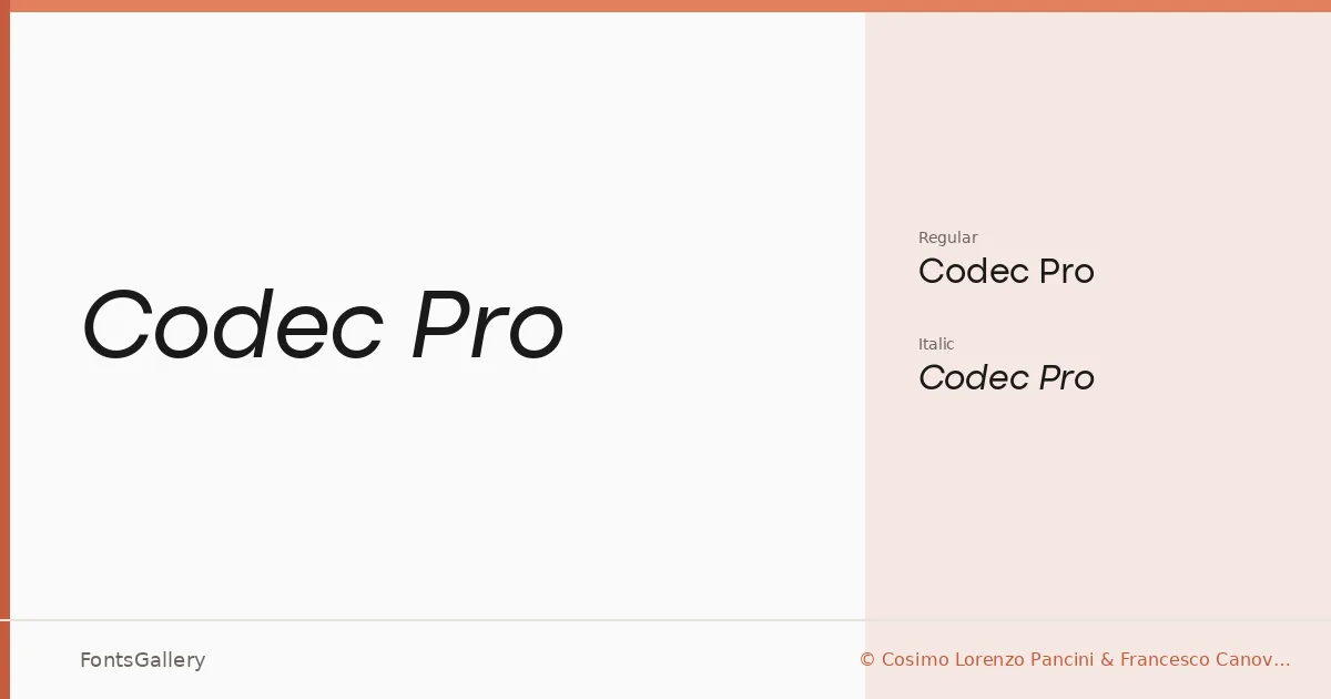
About Codec Pro Font
There is a particular restraint in how this sans-serif carries itself — nothing crowded, nothing decorative, just geometry kept honest and proportions that feel considered rather than calculated. It was designed by Cosimo Lorenzo Pancini and Francesco Canovaro, and it comes in two cuts: Regular and Regular Italic.
Design Aesthetics & Character Characteristics
The family sits comfortably in the space between minimal and professional — clean enough for modern editorial work, composed enough for corporate contexts. The two TTF styles share an elegance that reads with equal confidence at headline scale and in tighter body settings. The italic isn't merely slanted; it has its own momentum, making the pair feel like a complete, if deliberately lean, toolkit. Language coverage stretches across Latin, Cyrillic, Greek, and Arabic, which gives the family real reach across multilingual projects.
Recommended Usage & Font Pairing
It earns its place in branding systems, on business cards, in magazine layouts, and across website headers where a cool, modern register is needed — presentation decks especially benefit from its clean authority. For contrast, it sits well alongside serif-driven faces like Canela or ABC Arizona, picks up warmth next to the script energy of Armelie, and can hold its own against the heavier presence of 321 Impact or the geometric confidence of Kactigona.
License & Usage Terms
This family is distributed under a Personal Use license — personal-use terms only, meaning it is not cleared for commercial work in this form; confirm your intended use and purchase a commercial license at www.zetafonts.com before taking it into any client or revenue-generating project. Embedding is permitted for preview and print only, and redistribution in any form is not allowed under this agreement.