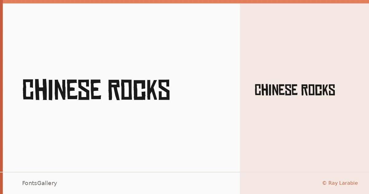
About Chinese Rocks Font
There is something immediately confrontational about this face — thick, roughened strokes that carry both grunge energy and a nod to vintage display lettering. It comes from Ray Larabie of Typodermic Fonts Inc., a designer known for pushing display type into territory that feels genuinely worn rather than artificially distressed. The single Regular cut is available in OTF format.
Design Aesthetics & Character Characteristics
This is display type built for impact: bold by nature, with a modern edge softened by vintage texture. The forms lean hard into grunge without losing legibility at large sizes — which is exactly where they belong. The weight feels hand-assembled rather than engineered, giving headlines and logotypes a rawness that clean geometric faces simply cannot fake.
Recommended Usage & Font Pairing
It earns its keep on posters, T-shirt graphics, branding projects, and anywhere a logo needs an aggressive, characterful anchor. Latin coverage keeps it focused on those Western-market applications. For pairings, the contrast between its rough personality and the precision of Helvetica or Bahnschrift works well for layouts that need a foil; Canela and Etna offer softer counterpoints for editorial contexts, while AQUA can echo the display energy without competing directly.
License & Usage Terms
Chinese Rocks is offered under Personal Use terms — commercial use is not permitted under this license, so confirm licensing before taking it into a paid branding or print job. Embedding is limited to preview and print only.