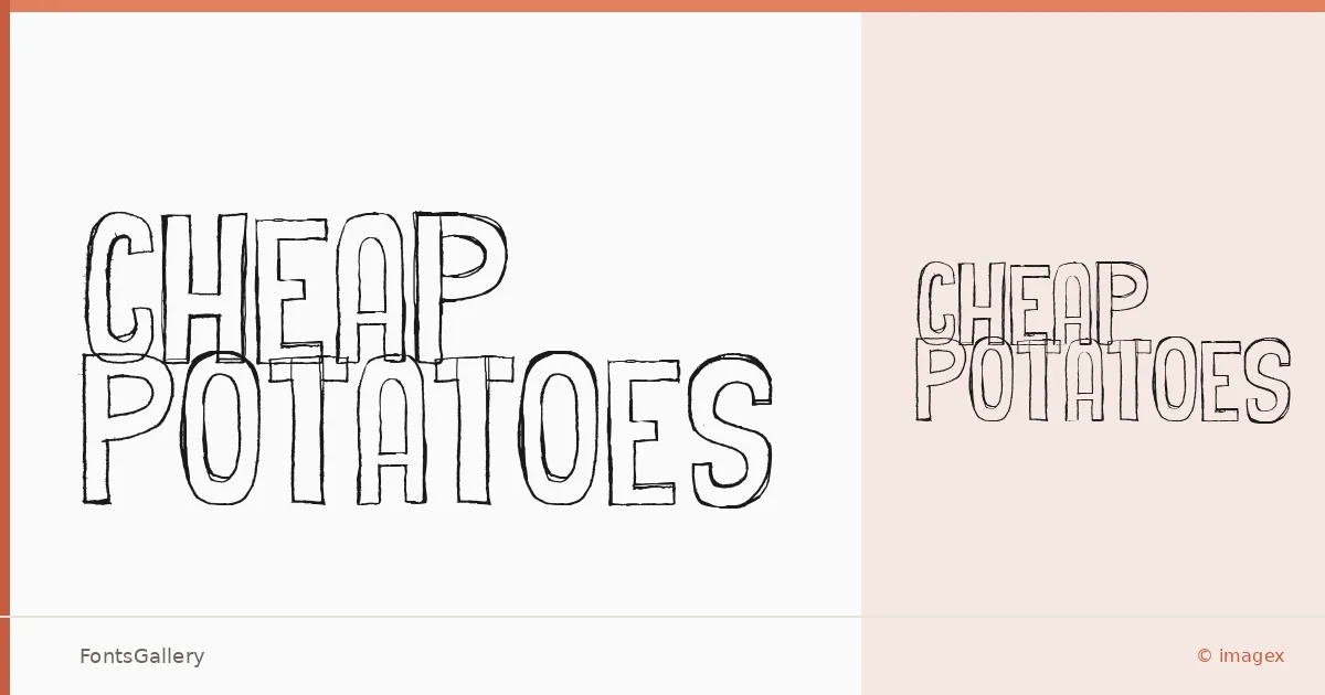
About Cheap Potatoes Font
There is something deliberately rough about this one — the kind of lettering that looks like it was pulled from a hand-painted sign or a worn label rather than drawn on a grid. Created by imagex using Scanahand, it carries the organic irregularity that only comes from a hand-originated process. The result is a single Regular weight with the kind of character that overdesigned display faces rarely achieve.
Design Aesthetics & Character Characteristics
Sitting squarely in the display category, the face reads as bold and playful while leaning into a rustic, vintage sensibility — think market stalls, craft goods, and anything that benefits from a human touch. The TTF file covers Latin script partially, so it is best treated as a headline or short-copy face rather than a workhorse for body text. Its irregularities are the point: they give logotypes and poster headlines a lived-in warmth that clean geometric faces cannot fake.
Recommended Usage & Font Pairing
It earns its keep in branding, logo lockups, posters, social media graphics, and t-shirt design — anywhere a single strong word or phrase needs to land with personality. For contrast pairing, the structured neutrality of Helvetica or Asap balances the roughness well, while Canela, ABC Arizona, or Etna offer softer editorial alternatives when you want warmth on both sides of the hierarchy.
License & Usage Terms
Cheap Potatoes is offered under Personal Use terms, which means commercial use is not covered — confirm licensing with the designer before committing it to any client or revenue-generating work. The font does carry editable embedding permission within documents.