About Character Font
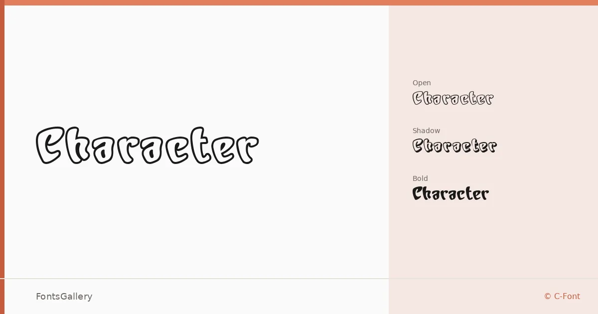
There is a confident swagger to these letterforms — thick strokes, a vintage flavor, and just enough eccentricity to hold attention at display sizes. The family was designed by C-Font, with the Bold cut credited to Masato Shimojima of Design Studio Creation. Three distinct personalities are packed into the release: an open inline treatment, a shadow variant, and a solid bold, each sharing the same underlying architecture.
Design Aesthetics & Character Characteristics
Sitting squarely in the display category, the family carries a playful, whimsical energy rooted in vintage lettering traditions. The three styles — Regular Open, Regular Shadow, and Bold Bold — let you layer or contrast effects without reaching for a separate family. The open cut rewards generous point sizes where the inline detail can breathe, while the shadow version adds depth that works well against photographic or textured backgrounds. Across all three, the forms stay bold and legible enough to read fast.
Recommended Usage & Font Pairing
The mood lands naturally on posters, branding marks, logo lockups, social media graphics, and t-shirt design — anywhere a headline needs personality rather than neutrality. Coverage extends to Latin (partial), so it suits English-language work and related Western scripts within that subset. For body copy or secondary text, the listed pairings Etna, Canela, Bahnschrift, ABC Arizona, and Helvetica each offer clean contrast to the family's expressive weight.
License & Usage Terms
This family is distributed under Personal Use terms, which means commercial use is not permitted — confirm licensing directly with the rights holder before deploying it in any paid or client-facing work. The font is licensed with installable embedding permissions.