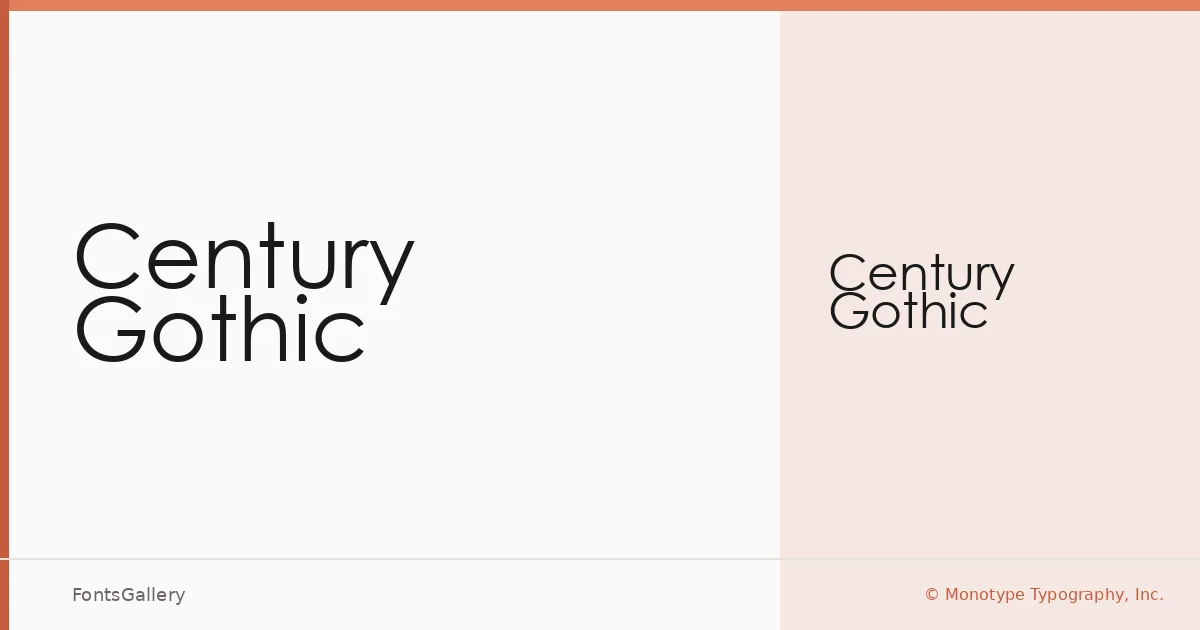
About Century Gothic Font
There is something immediately recognizable about the near-perfect circles of the lowercase 'o' and 'c' — a geometry that traces directly back to the 1920s and 30s modernist sans-serif movement. This face from the Monotype Type Drawing Office is rooted in Monotype 20th Century, the original design drawn by Sol Hess between 1936 and 1947. The version here refines that heritage with a taller x-height and adjustments tuned for contemporary digital output, keeping the letterforms clean and optically consistent at screen and print resolutions alike.
Design Aesthetics & Character Characteristics
The overall feeling is minimal and unhurried — wide, open counters and near-monolinear strokes give it an elegant, professional composure that sits comfortably in modern brand work. The family is available here as a single Regular Normal cut in TTF format, which concentrates its usefulness on display and headline settings rather than extended body copy. Latin, Cyrillic, and Greek are all covered, broadening its reach considerably for international projects.
Recommended Usage & Font Pairing
It earns its place most naturally in branding, logo work, magazine layouts, business cards, and presentation decks — anywhere a clean, geometric authority is needed without visual noise. For contrast in pairing, the fluid curves of Armelie or the editorial weight of Canela make strong companions, while 321 Impact, AQUA, or Kactigona can push a layout in a bolder, more graphic direction.
License & Usage Terms
Century Gothic is distributed under a Personal Use license from Monotype Typography, Inc., which does not permit commercial use — confirm your rights directly with Monotype at www.monotype.com/html/type/license.html before deploying it on any commercial job. Embedding is set to installable.