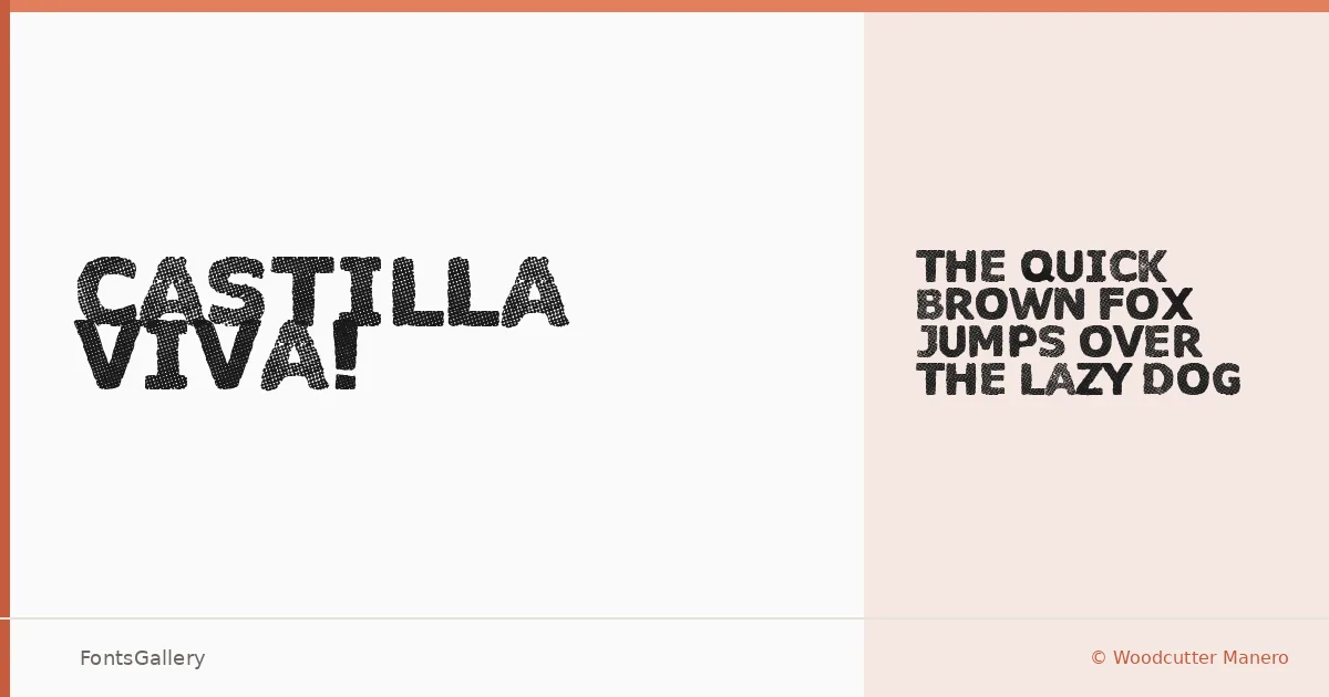
About Castilla Viva! Font
There is genuine grit in this display face — the kind of textural roughness that looks like it was pressed into paper with too much ink and exactly the right amount of conviction. It comes from Woodcutter Manero, whose Fonts Lab has been producing raw, expressive display work in Spain. The single Regular cut arrives in OTF format, carrying a grunge-worn character that reads immediately as handcrafted and deliberate.
Design Aesthetics & Character Characteristics
This is a bold, rustic display type with a vintage sensibility — the kind of letterforms that feel weathered and authoritative at the same time. The grunge texture is built into the shapes themselves rather than applied as an effect, which keeps it feeling honest at large sizes. There is only the one weight to work with, so the design has to do everything on its own, and largely it does.
Recommended Usage & Font Pairing
It belongs on posters, in branding lockups, on T-shirt graphics, and in logo treatments where a rough, heritage-inflected tone is the point — anywhere a headline needs personality over polish. Latin-script projects are the natural territory. Paired against a clean neutral like Helvetica or Asap, or set alongside the editorial softness of Canela or ABC Arizona, the contrast is productive; Etna makes another sympathetic companion for projects that want to stay in a warmer register.
License & Usage Terms
This family is released under Personal Use terms, which means commercial use is not permitted — confirm licensing before taking it into a paid job by contacting Woodcutter Manero directly at [email protected] or through woodcutter.es.