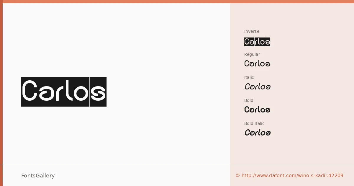
About Carlos Font
There is a clean directness to these letterforms — no unnecessary ornament, just confident strokes that hold their own at large sizes. The family carries a copyright from weknow and was built in OTF format, covering Latin, Cyrillic, and Greek scripts across its five cuts: Regular, Regular Italic, Bold, Bold Italic, and the distinctive Regular Inverse.
Design Aesthetics & Character Characteristics
This is a modern sans serif with a minimal, professional character — the kind of face that reads as deliberate rather than neutral. The Regular and Bold weights feel balanced without being rigid, and the Italic cuts add just enough movement to keep the system useful across a layout. The Inverse style offers a ready-made reversed treatment, useful when you need contrast without building it from scratch. The mood throughout is bold and considered, which suits headline and display work more than extended text.
Recommended Usage & Font Pairing
The proportions and weight range make it a natural choice for branding, logo work, magazine headlines, and posters where clarity at scale matters. The Cyrillic and Greek coverage extends its reach well beyond Latin-only markets. It pairs with Canela, Armelie, 321 Impact, AQUA, and Kactigona, giving you options to mix its geometric discipline against serif warmth or expressive display faces depending on the job.
License & Usage Terms
Carlos is released under Personal Use terms, which means commercial use is not permitted — confirm licensing directly with the rights holder before using it in any paid or commercial project. The embedding permission is set to editable.