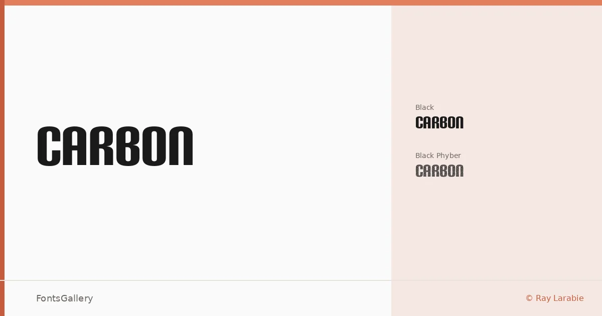
About Carbon Font
There is a hardness to these letterforms — an industrial weight that feels machined rather than drawn. Raymond Larabie of Typodermic Fonts Inc. designed this display family, and it carries the kind of authority you expect from someone who has spent decades pushing display type to its structural limits. The two cuts, Carbon Black and Carbon Phyber, share the same heavy Black weight but diverge sharply in texture: one is solid and unyielding, the other laced with a fiber-like internal pattern that catches the eye without softening the blow.
Design Aesthetics & Character Characteristics
Both styles sit firmly in the display category, built for scale and impact rather than extended reading. The mood is futuristic and bold — think fabricated materials, tensile strength, precision engineering translated into Latin letterforms. Carbon Phyber's surface treatment adds a layer of visual complexity that rewards large reproduction, while Carbon Black keeps things direct and monolithic. Both are delivered as OTF files.
Recommended Usage & Font Pairing
This family earns its place in headlines, posters, branding systems, logo lockups, and T-shirt graphics where a strong, modern presence is non-negotiable. The Latin character set covers the expected range for Western European work. For pairing, the clean neutrality of Helvetica or Bahnschrift makes a natural counterweight to the family's density, while Canela brings an elegant contrast in editorial contexts; Etna and AQUA offer bolder, more characterful alternatives when the surrounding design can carry the tension.
License & Usage Terms
This family is available under Personal Use terms — commercial use is not permitted under the current license, so confirm your rights before taking it into a paid project. Embedding is limited to preview and print only.