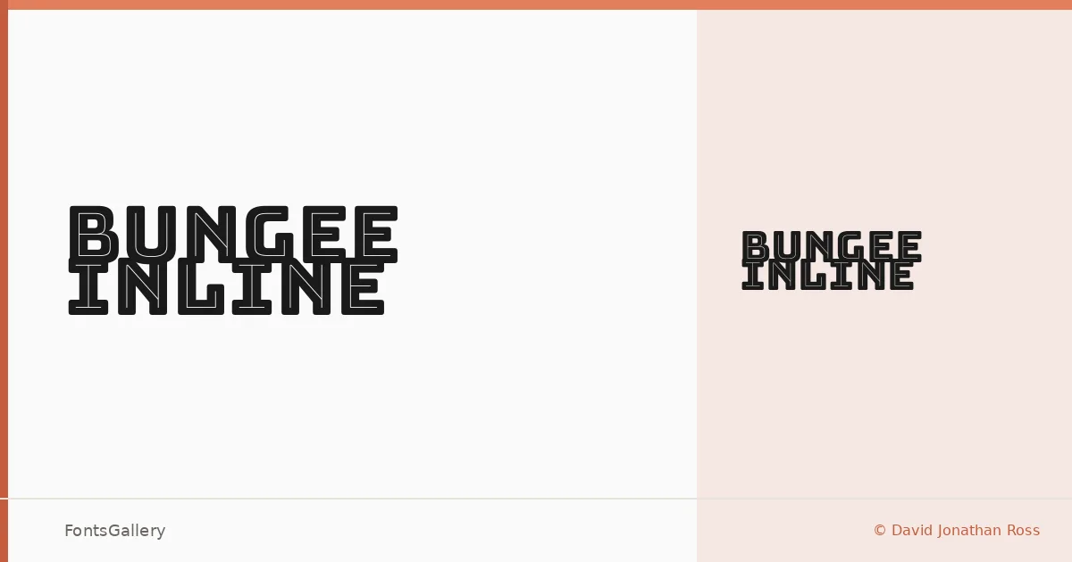
About Bungee Inline Font
There is something immediately physical about this face — the inline stroke cuts through each letterform like a painted sign caught in strong light, giving the design an almost dimensional quality. David Jonathan Ross built it with vertical setting and urban display work in mind, and that intention shows in every capital. The single cut available, Regular, delivers that inline treatment at full force without needing a range of weights to make its point.
Design Aesthetics & Character Characteristics
This is a display typeface that sits at the intersection of bold and vintage — it carries the confident geometry of modern signage while carrying an undeniable nod to hand-lettered American storefronts and fairground type. The inline detail is not decorative noise; it is structural, tightening the color of each letter and giving headlines and poster work a sense of crafted density. It ships as a TTF and covers Latin and Vietnamese, making it usable across a wider range of projects than its street-sign personality might first suggest.
Recommended Usage & Font Pairing
It earns its place in branding, poster composition, signage, and T-shirt design — any context where a headline needs to feel printed, stamped, or painted rather than simply typeset. The face holds particularly well at large sizes where the inline detail can breathe. For text accompaniment, it has been paired with Etna, Canela, Helvetica, AQUA, and Bahnschrift, each offering a different tonal contrast depending on whether you want warmth, neutrality, or a clean utilitarian counterpoint.
License & Usage Terms
Released under the SIL Open Font License, Version 1.1, with full commercial use permitted and installable embedding rights — details and the accompanying FAQ are available at https://openfontlicense.org.