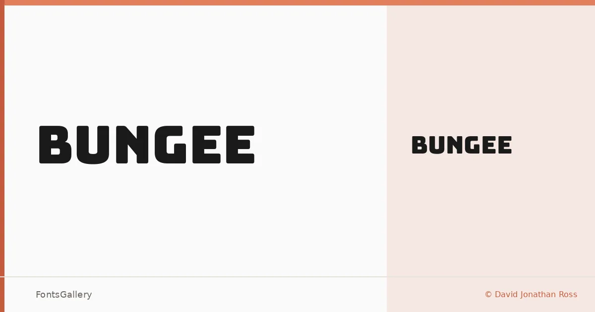
About Bungee Font
There is something unmistakably architectural about this display face — the letterforms carry the weight and clarity of painted signage, with a confidence that reads from a distance before it reads up close. It comes from David Jonathan Ross, whose work consistently prioritizes the practical mechanics of how type actually performs in context. The single Regular cut is tightly drawn, with strong verticals and a structure borrowed from vernacular lettering traditions.
Design Aesthetics & Character Characteristics
Sitting firmly in the display category, the design reads as bold and modern without leaning into abstraction — it stays grounded in legibility even when scaled large. The forms have a professional directness to them: no decorative excess, just density and presence. Available as a TTF in a single Regular weight, it is built for situations where one confident style is all you need. Coverage extends across Latin and Vietnamese, making it genuinely useful for multilingual headline work.
Recommended Usage & Font Pairing
The obvious applications are headlines, posters, signage, and logo lockups — anywhere the type needs to hold its own against competing visual noise. It also translates well to T-shirt design, where that sign-painter solidity earns its keep at smaller sizes. For pairing, the structured boldness here sits well alongside the editorial softness of Canela or the neutral precision of Helvetica and Bahnschrift; Etna and AQUA offer more expressive contrast for layout work that wants a bit more tension.
License & Usage Terms
Released under the SIL Open Font License, Version 1.1, commercial use is permitted, and the font carries installable embedding permissions — full terms and FAQ are at https://openfontlicense.org.