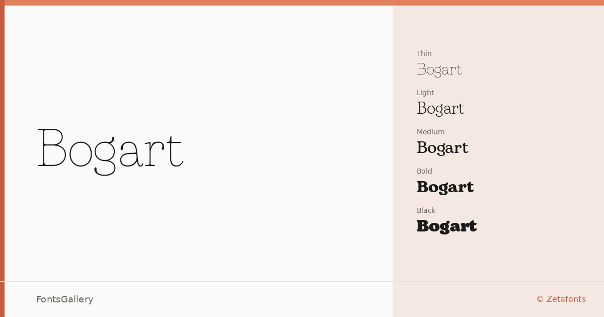
About Bogart Font
There is a particular tension in a slab serif that manages to feel both authoritative and refined — and that is exactly what Francesco Canovaro, Mariachiara Fantini, and Andrea Tartarelli have built here at Zetafonts. The family runs from Thin through Black, each weight paired with a true italic, giving you eighteen styles in total. The serifs carry a vintage character without leaning into pastiche, and the stroke contrast is just controlled enough to keep the whole thing feeling professional at any size.
Design Aesthetics & Character Characteristics
This is a classic slab serif with an elegant, slightly editorial temperament — the kind of face that reads as serious in a headline and graceful in a logo lockup. The range from Thin Thin through Black, all in TTF format, means the weight you need exists somewhere in the spectrum, whether that is the barely-there delicacy of the lightest cuts or the commanding density of the heaviest. The italics throughout are genuinely expressive rather than simply sloped, which gives the family real range across both formal and warmly vintage contexts.
Recommended Usage & Font Pairing
The weight range and classical structure make this well suited to magazine headlines, editorial posters, branding systems, and logo work where a strong typographic foundation is needed. Language support covers Latin, Vietnamese, Cyrillic, and Greek, which broadens its reach considerably across multilingual branding and publishing projects. It pairs well with Helvetica or Bahnschrift for a clean contrast between slab and geometric sans, and with Etna, Armelie, or Kactigona when a more expressive or display-oriented combination is appropriate.
License & Usage Terms
This family is offered under a Personal Use license, which permits individual non-commercial use only — corporate entities, studios, and commercial projects require a separate commercial license purchased directly from www.zetafonts.com. Confirm your use case before committing this to any paid work.