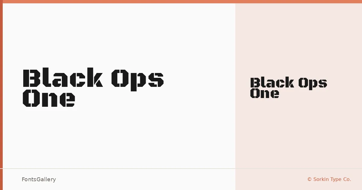
About Black Ops One Font
There is a muscular density to these letterforms — wide, upright, and cut with a semi-geometric logic that feels more engineered than calligraphic. Designed by James Grieshaber and Eben Sorkin at Sorkin Type Co., it delivers a single weight — Regular — built with low contrast and a structural confidence that suits display use almost exclusively. The strokes carry a grunge edge without sacrificing the kind of legibility that branding work demands.
Design Aesthetics & Character Characteristics
This is a display face, bold in presence and modern in its geometry, landing somewhere between industrial stencil and heavy editorial type. The single Regular cut means there is no interpolation to lean on — you work with what is there, which is a strong, commanding block of ink that reads clearly at headline scale. It arrives as a TTF file and covers Latin, Latin Extended (partial), and Vietnamese, giving it enough range for multilingual campaigns and Latin-script branding that extends into Southeast Asian markets.
Recommended Usage & Font Pairing
The weight and attitude here make it a natural fit for posters, logos, T-shirt design, and any headline that needs to hold its own at large sizes without decoration. It would sit comfortably alongside the elegance of Canela or ABC Arizona, where the contrast between soft and hard is the point, or it can be grounded with the neutrality of Bahnschrift or Helvetica for a more disciplined graphic system. Etna offers another structural option when the pairing needs to stay within a display register.
License & Usage Terms
Released under the SIL Open Font License (OFL), Version 1.1, which allows commercial use — full details and the accompanying FAQ are at https://scripts.sil.org/OFL. Embedding is set to installable.